%201.webp)
02
AI Snaps
.svg)
.svg)
01
Our Work

03
About Us
05
Contact Us
06
Client Success

07
Blogs
08
Careers
Book A Call


The brand book, often referred to as the brand bible, brings together everything that defines how a brand looks, sounds, and behaves. This becomes especially important in categories where multiple brands operate in close proximity but are clearly differentiated through identity and expression.
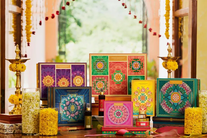
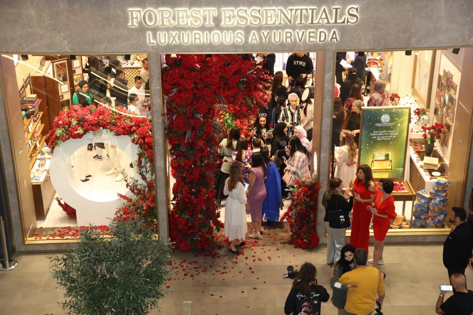
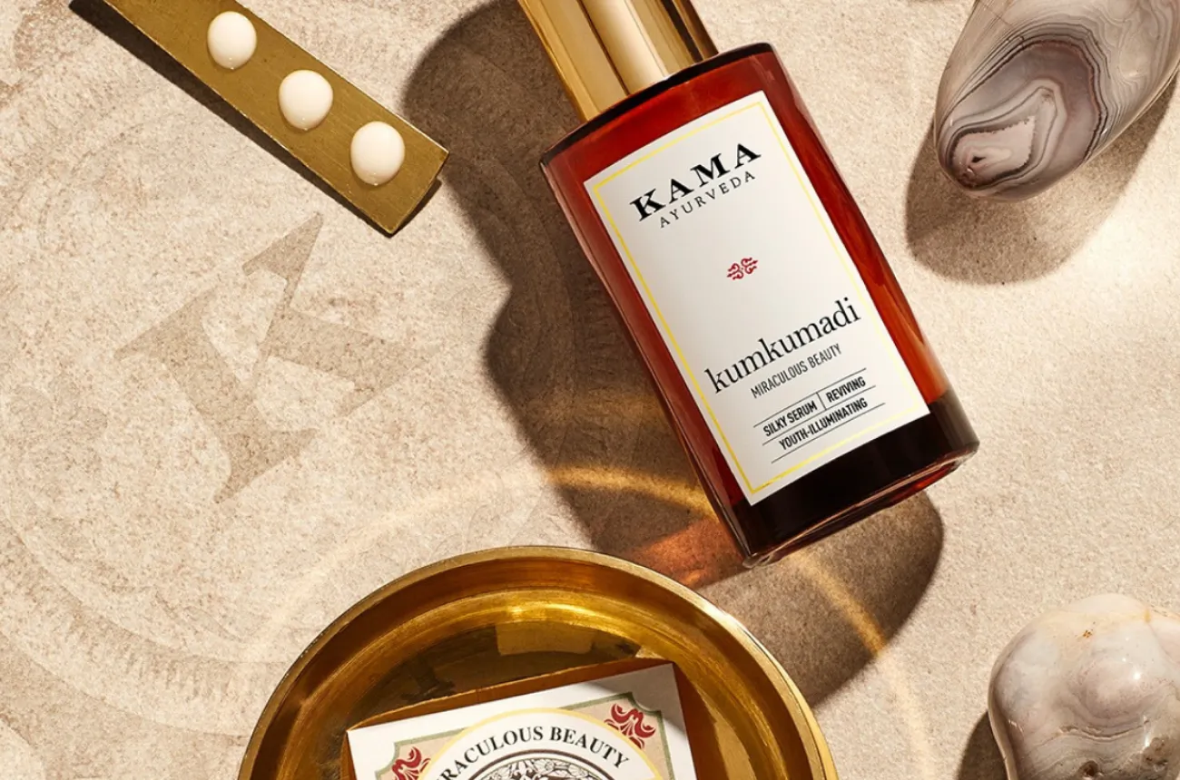
Indian skincare and beauty brands offer a clear example. Dot & Key, Plum, Kama Ayurveda, Forest Essentials, Indie Wild, The Derma Co, and Aqualogica all exist within similar categories, yet feel fundamentally different from one another. Even within the same parent group, brands like Mamaearth, Aqualogica, and The Derma Co under Honasa follow distinctly different visual systems, tones, and brand philosophies. That clarity does not happen by chance. It comes from strong, well-documented brand guidelines that are built to last and designed to be followed.
The role of a brand book is to ensure consistency as the brand scales. Teams evolve, designers change, and agencies come and go, but the brand must continue to look and feel the same. At Confetti Design Studio, brand guidelines are the tool that makes that continuity possible, acting as the definitive reference point that allows a brand to grow without losing its identity.
At Confetti, brand guidelines are built across two equally important dimensions: strategy and visuals. Neither is treated as secondary to the other.
The strategic layer defines the brand's positioning, messaging direction, personality, tone of voice, and overall intent. It captures the thinking behind the brand so that anyone working on it, whether in-house or through an external partner, understands not just what the brand looks like but what it stands for and how it should communicate.
The visual layer includes the logo and all its usage variations, colour palette, typography, layout principles, imagery direction, iconography, and the broader design system the brand operates within. Together, these two layers create a complete picture of the brand that leaves no room for misinterpretation.
The impact of this is visible across categories. In coffee and beverages, brands like Blue Tokai, Rage Coffee, Sleepy Owl, Bevzilla, and Country Bean all operate in the same space yet feel completely different in tone and visual expression. That difference is not accidental. It is the outcome of clearly defined guidelines that shape how every touchpoint is designed and communicated. Without that structure, brands risk looking inconsistent or interchangeable over time, regardless of how strong the original identity was.
At Confetti, brand guidelines are designed to be practical, detailed, and straightforward to execute. We document not just what the brand should look like, but also what it should never do. This includes incorrect logo usage, spacing violations, distortion rules, colour misapplications, and common errors that erode brand consistency over time.
We go deep into real-world usage by creating 10, 20, and sometimes up to 25 mockups across key touchpoints, including social media posts, packaging formats, marketing collateral, and digital assets. This level of detail ensures that even a junior designer or a new agency partner has a clear and unambiguous reference for how the brand should be applied, without needing to interpret or second-guess the guidelines.
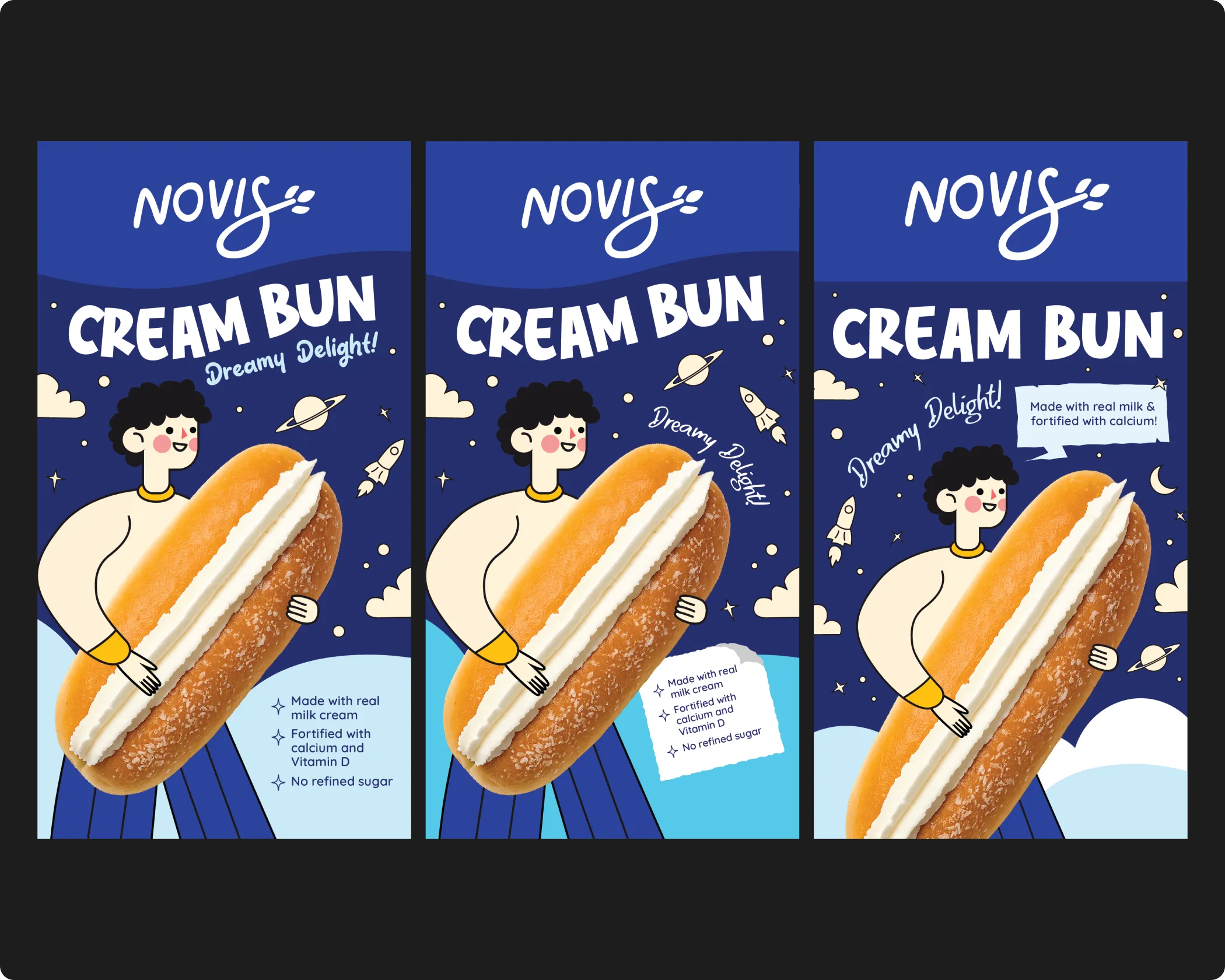
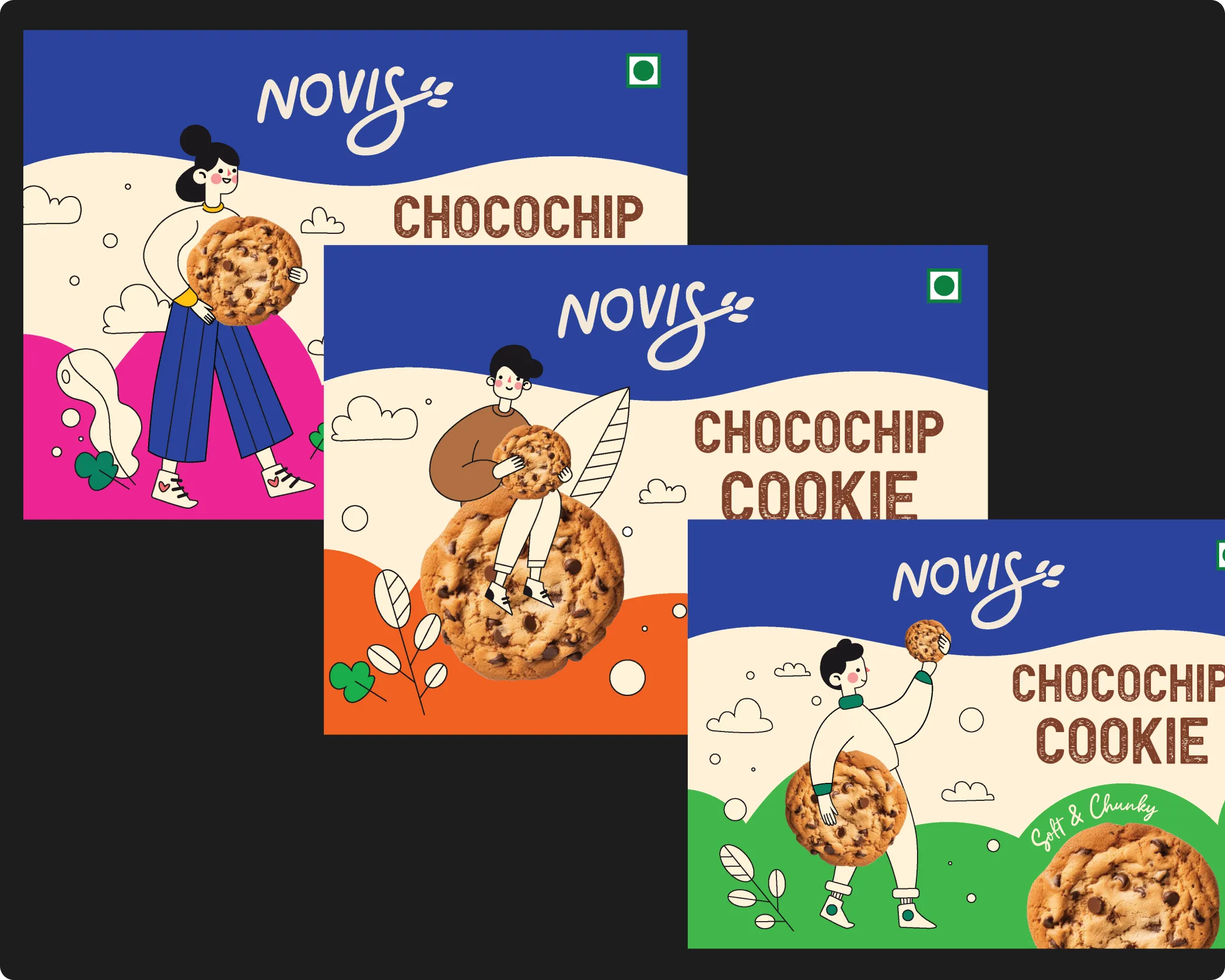
Photography direction is an integral part of the process. Visual style plays a significant role in brand perception, and brands within the same category can feel vastly different based on how they approach imagery alone. We define clear photography guidelines rooted in the brand's positioning and identity, covering composition, lighting, styling, mood, and visual energy. This ensures that whether images are shot in-house, sourced externally, or generated, they remain consistent and distinctly on-brand across every application.
This is the process we have applied across 200+ brand projects, including work for FMCG and retail brands trusted by names like ITC and Dabur.
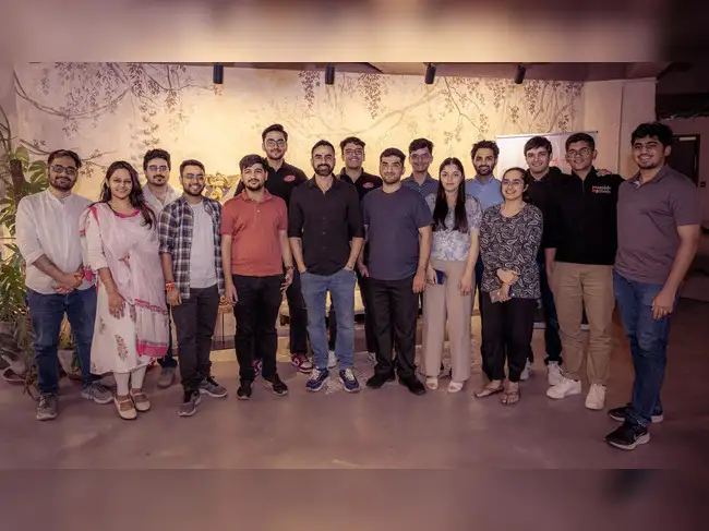
Confetti’s team is trusted by global leaders, and it’s time we join forces with you to create your Iconic brand!
Tap the button below and talk to our founders directly.
.webp)

Brand guidelines fail most often when they are treated as surface-level documentation rather than working tools designed to be used every day. The most common mistakes we encounter include:
Well-built brand guidelines remove ambiguity. They allow teams to move faster, make fewer mistakes, and scale the brand without constantly revisiting or reinventing how it should look and feel.
In FMCG and retail, brand consistency is a commercial asset. Every time a consumer encounters the brand, whether on shelf, in a digital ad, on a delivery box, or on social media, that interaction either reinforces or weakens the impression the brand is trying to build. Consistency reinforces it. Inconsistency erodes it, often in ways that are difficult to trace back to a single cause.
For brands operating across multiple SKUs, retail formats, digital channels, and marketing partners, the risk of inconsistency is significant. Without clear guidelines, different teams and agencies will make different decisions about how the brand looks and sounds, and those differences compound over time. The result is a brand that feels fragmented rather than cohesive, even if each individual piece of communication looks acceptable in isolation.
Brand guidelines are what prevent that fragmentation. They give every person who works on the brand, internally or externally, a shared and authoritative reference that keeps every touchpoint aligned. For fast-growing FMCG and retail brands, that alignment is not a design preference. It is what protects the brand equity being built through every product, every campaign, and every customer interaction.
Every set of brand guidelines Confetti produces is specific to the brand, the category, and the scale at which our client is operating or planning to operate. We build documentation that is thorough without being inaccessible, covering both the strategic intent behind the brand and the practical rules that govern how it is applied across every touchpoint.
If you are building a new brand and need guidelines that can scale from day one, or if your existing brand has grown without a clear reference document and consistency is suffering as a result, this is where that work gets done properly. Get in touch with Confetti to understand how we approach brand guidelines for your category.
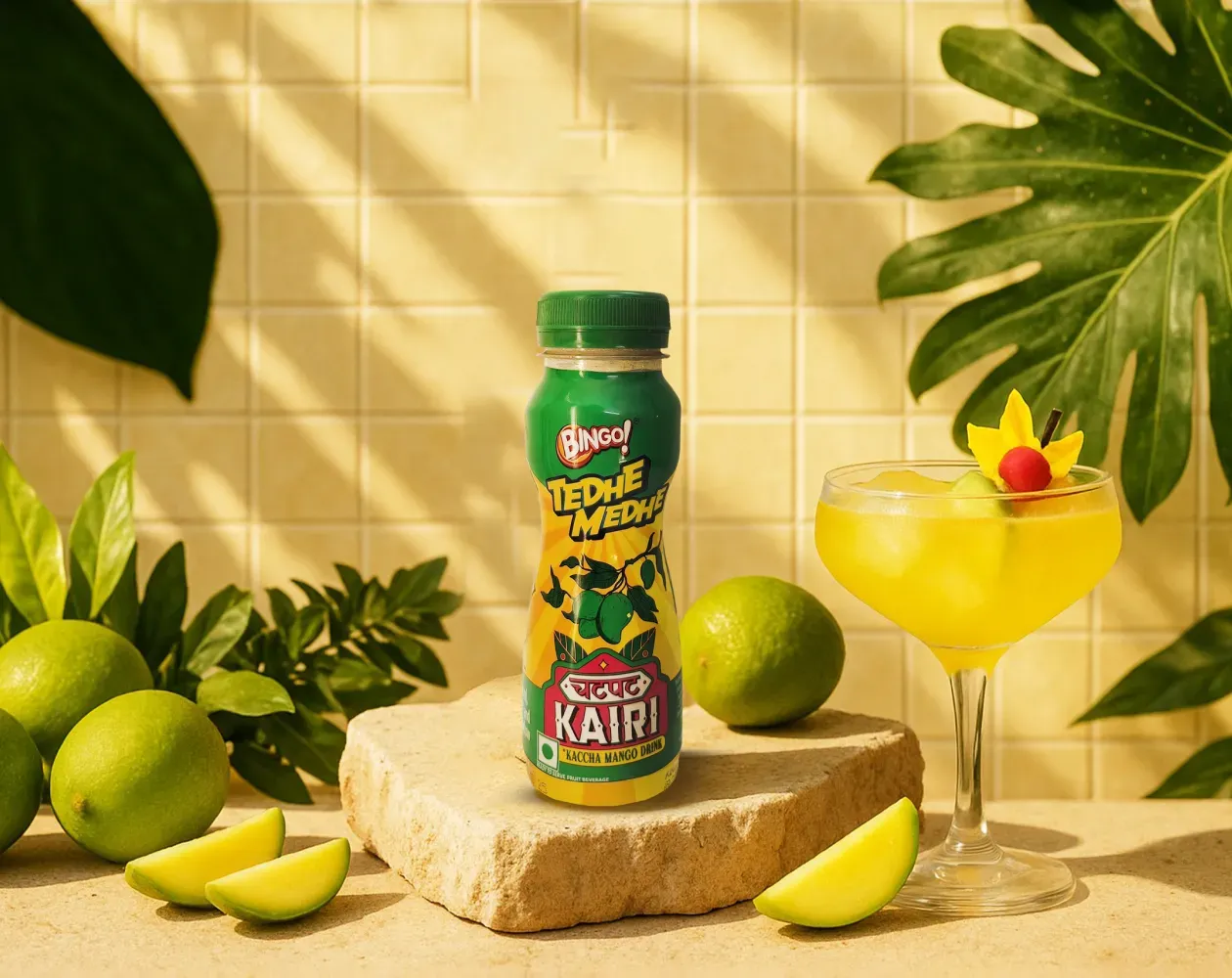
We worked with Bingo (by ITC) to help them launch India’s next viral beverage; Aam Panna
%201.webp)
Global award-winning Identity & packaging design for US's health & lifestyle startup AIM Nutrition
-p-2000%201.webp)
Building India’s fastest growing D2C supplements brand, Miduty by redesigning their branding, packaging & e-commerce website
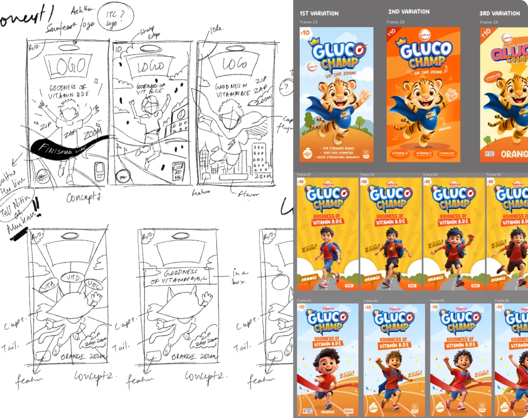
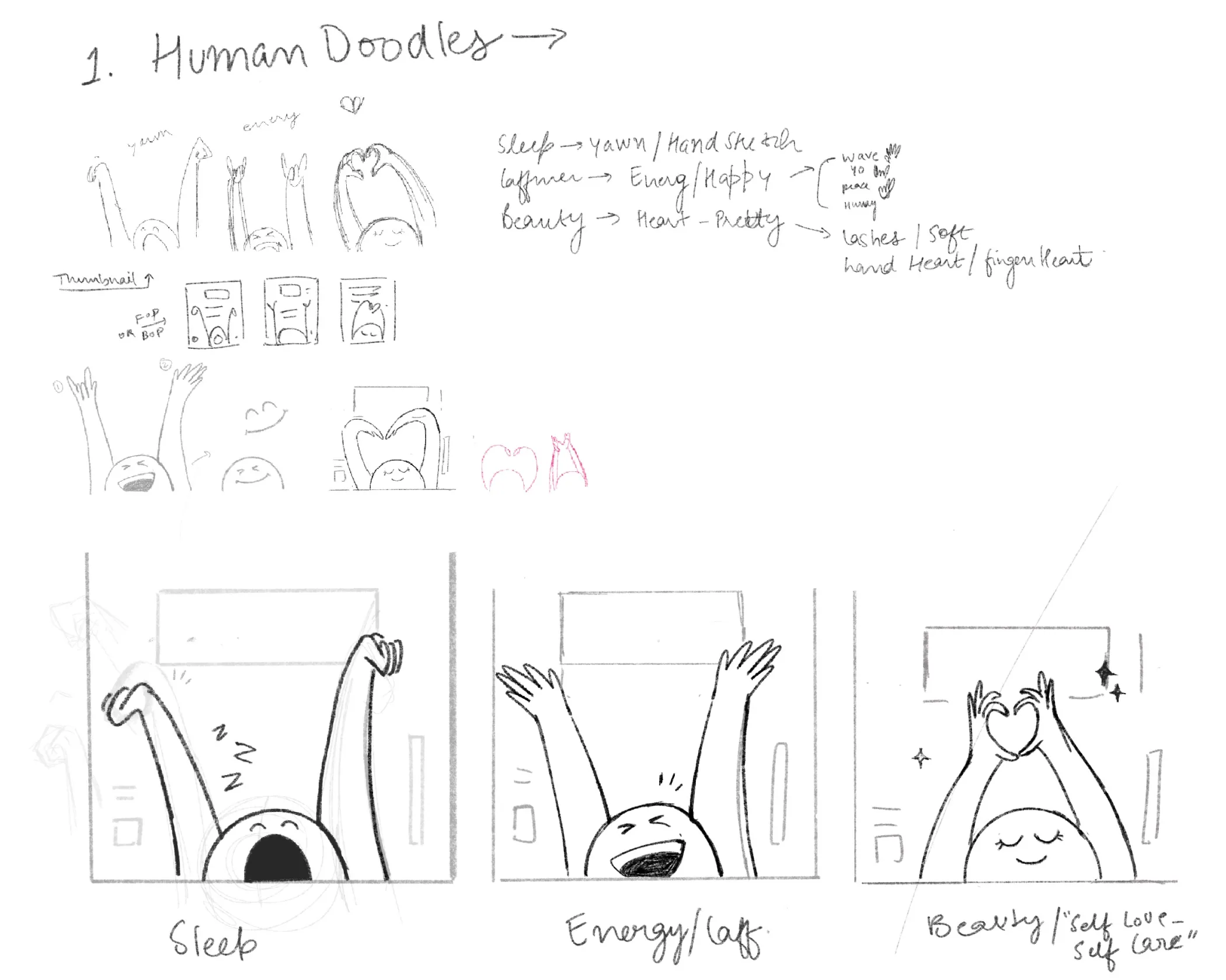
A mascot only works when it has a clear role to play. It shouldn’t exist just to look friendly or fill space. The strongest mascots help personify the brand, make communication more approachable, and support how the brand wants to behave in the world. When that purpose isn’t defined, mascots can quickly become visual clutter or distract from the brand’s core message.
A good example is Duolingo. Its owl mascot draws on ideas of wisdom while keeping the learning experience light and playful, which fits perfectly with how the brand speaks to its audience. At Confetti, we evaluate mascots strategically, from whether a human, animal, or imaginary character makes sense, to the emotion the mascot should convey. If you’re unsure whether a mascot would genuinely add value to your brand or simply add noise, hopping on a short call with our experts can help you make that call with confidence.
Mascots tend to work best for brands that benefit from warmth, approachability, or repeated interaction. This is why they’re often seen in education, community-led platforms, and categories where playfulness helps lower barriers. In food and beverage, especially, mascots have long helped brands build familiarity and recall, think of Cap'n Crunch, M&M’s, or Cheetos. These characters aren’t random; they give the brand a recognisable face and a consistent way to communicate personality.
That said, a mascot isn’t right for every brand. At Confetti, we consider mascots selectively and never force them into an identity where they don’t belong. Some brands are better served by restraint or authority rather than character-led expression. If you’re weighing whether a mascot fits your category, audience, and long-term goals, getting on a quick call with our team can help you assess that fit before committing to the idea.
A mascot needs to feel like a natural extension of the brand, not an add-on. That alignment comes from anchoring it in the brand’s archetype, tone of voice, and audience expectations. When those elements are clear, the mascot’s personality, behaviour, and visual style tend to fall into place. It starts communicating in the same way the brand would, just in a more personified form.
You can see this clearly with Duolingo, where there is a green coloured owl mascot that mirrors the brand’s playful and encouraging tone, while still tapping into the idea of wisdom associated with learning. At Confetti, mascots are always designed after the brand archetype is defined, so they reinforce positioning rather than distract from it. If you want to make sure a mascot strengthens your brand instead of feeling gimmicky, hopping on a quick call with our experts can help sense-check that alignment before anything is designed.
Introducing a mascot comes with real trade-offs. If it isn’t thought through properly, it can overpower the brand, feel immature, or lock the brand into a tone it later struggles to grow out of. This happens often with early-stage D2C brands that introduce a mascot too quickly, only to realise later that it no longer fits where the business is headed. What felt friendly at launch can start to feel limiting as the brand matures.
At Confetti, we always look at the long-term implications first. We assess whether a mascot is genuinely needed, what role it would play in communication, and how it would evolve before moving anywhere near design. Strategy comes first, character second. If you’re considering a mascot and want to understand the risks before committing, getting on a short call with our team is the best way to evaluate whether it’s a smart move for your brand.
A mascot stays effective over time only when it’s treated as part of the brand system, not a one-off illustration. That means defining clear rules around where it appears, how it behaves, what expressions it can use, and the contexts it belongs in. Strong mascots are consistent in character, even as they adapt to new formats, platforms, or campaigns. They evolve, but they don’t change personality every time they show up.
At Confetti, we build mascot guidelines directly into the wider brand system. This includes usage rules, variations, tone, and examples, so everyone across the organisation knows how to use it in the same way. That’s what makes a mascot scalable rather than dependent on a single designer or team. If you’re thinking about longevity and consistency, hopping on a short call with our experts can help you understand what needs to be defined now to avoid issues later.


Lorem ipsum dolor sit amet, consectetur adipiscing elit. Suspendisse varius enim in eros
Lorem ipsum dolor sit amet, consectetur adipiscing elit. Suspendisse varius enim in eros
Lorem ipsum dolor sit amet, consectetur adipiscing elit. Suspendisse varius enim in eros
.svg)
.svg)


.svg)
.webp)


.webp)


.webp)


.webp)