%201.webp)
02
AI Snaps
.svg)
.svg)
01
Our Work

03
About Us
05
Contact Us
06
Client Success

07
Blogs
08
Careers
Book A Call


Mood boards are the first step in translating brand strategy into visual language. Once positioning, storyline, and brand archetype are finalised, the mood board becomes the bridge between strategy and design execution. At Confetti Design Studio, this step is not treated as an aesthetic warm-up. It is a strategic tool that ensures every visual decision made downstream is grounded in intent rather than personal taste.
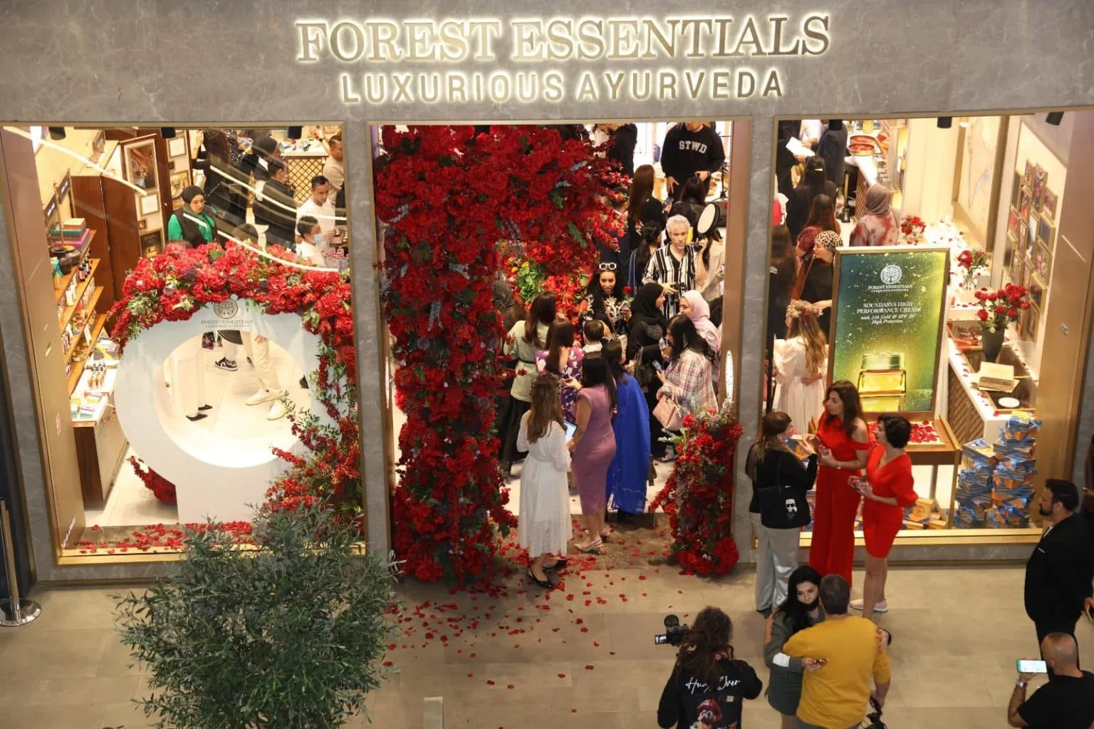
This step is especially critical in categories where visual cues strongly influence perception. If you are building a premium Indian brand, for instance, the idea of premium can be interpreted in several genuinely different ways. The visual language of Forest Essentials sits in an entirely different register from that of D'you, Kama Ayurveda, Blue Tokai, or Nicobar, even though all five could be described as premium. Mood boards are what define which version of premium a brand should lean into, and they do so before a single design decision is made.
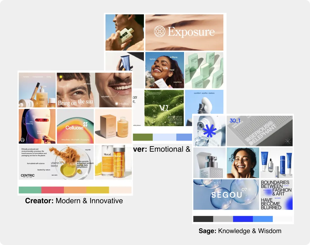
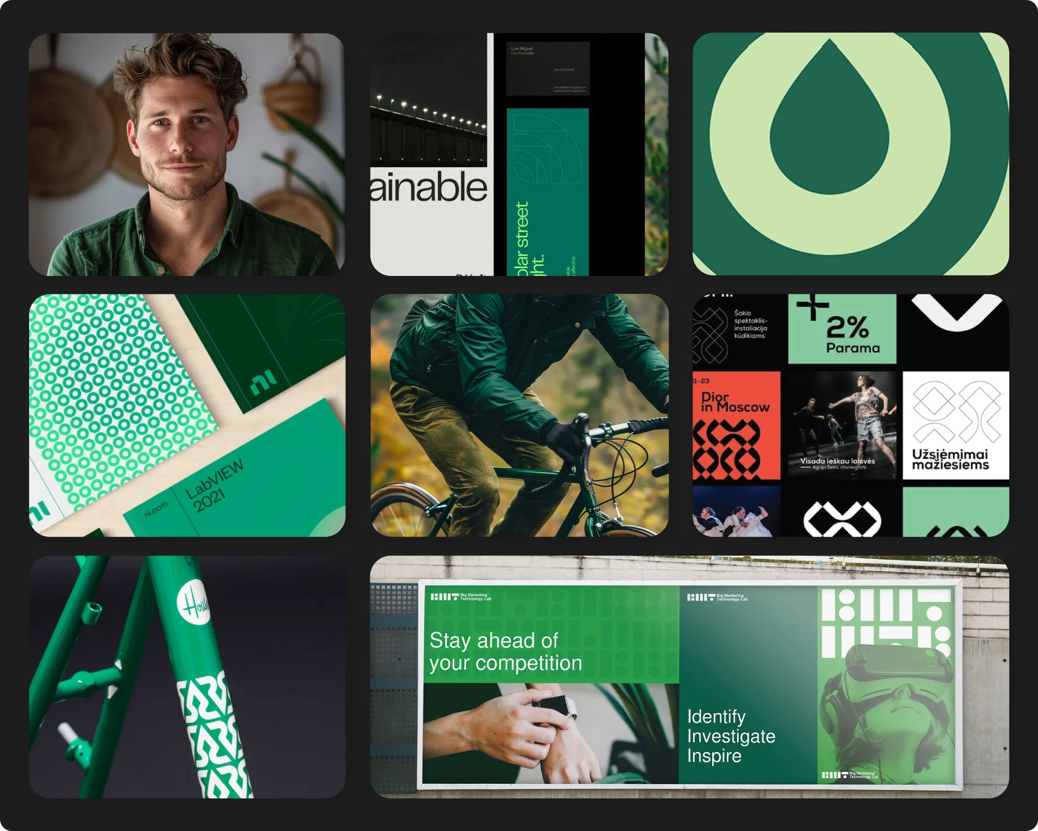
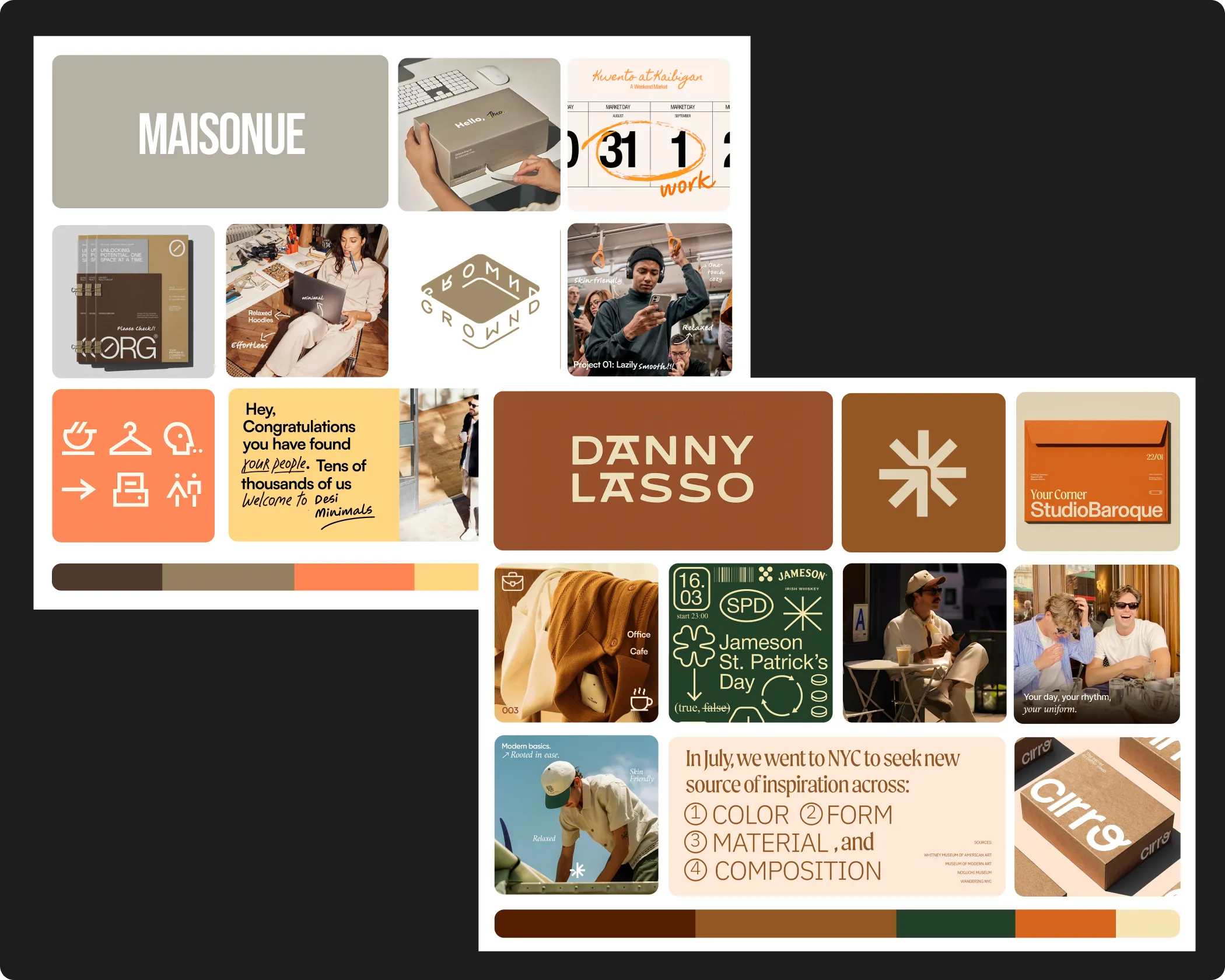
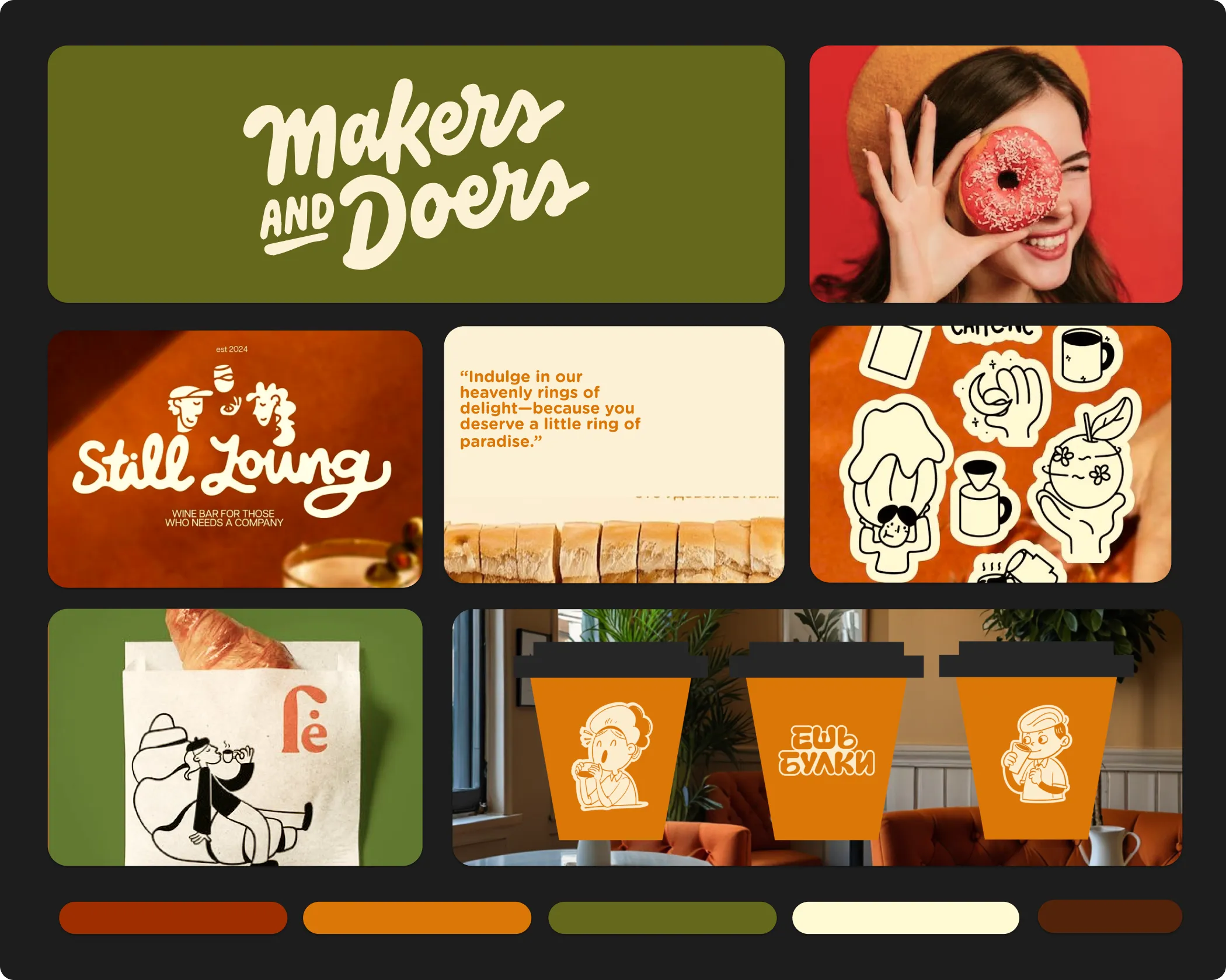
At Confetti, we work from the understanding that a single positioning or archetype can be interpreted in multiple visually distinct ways. Even within the same archetype, such as the Ruler, premium expression can range from understated and minimal to bold and commanding. Presenting only one visual direction at this stage would artificially narrow the creative possibilities available to the brand.
Instead, we typically develop two to three distinct mood boards for the same positioning. Each mood board is built using a combination of AI-generated imagery, curated photography, model references, sample product visuals, logo style references, typography, colour systems, patterns, and iconography. This gives clients a clear and tangible sense of what different strategic directions could look like at the finish line, rather than asking them to imagine it from a written brief.
A mood board is a visual representation of a brand's strategy, positioning, and personality. It brings together elements such as imagery, photography style, colour palettes, typography references, textures, patterns, iconography, and overall visual tone to communicate how the brand should feel rather than simply what it might look like.
A mood board is not a collection of aesthetic references pulled together for inspiration. It is a strategic alignment tool. It ensures that all stakeholders, from founders and marketing teams to designers and packaging partners, share a common understanding of the visual direction before execution begins. This shared reference reduces ambiguity, minimises costly revisions, and ensures that the final design output reflects the strategic intent behind the brand rather than the subjective preferences of whoever happens to be in the room.
By seeing multiple interpretations side by side, clients are able to make informed decisions about which visual language best reflects their brand's personality, consumer expectations, and long-term vision. The chosen mood board then becomes the definitive reference point for every design decision that follows, from logo development and packaging to digital presence and brand communication. This is the process we have applied across 200+ brand projects, including work for FMCG and retail brands trusted by names like ITC and Dabur.
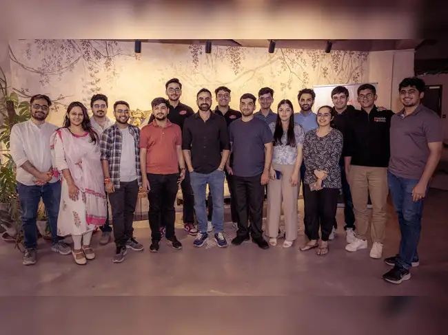
Confetti’s team is trusted by global leaders, and it’s time we join forces with you to create your Iconic brand!
Tap the button below and talk to our founders directly.
.webp)

Mood boards lose their effectiveness most often when they are treated as surface-level inspiration rather than strategic tools. The most common mistakes we encounter include:
Without multiple interpretations and the ability to create custom visuals that go beyond what stock libraries offer, mood boards risk narrowing creative potential rather than expanding it.
In FMCG and retail, visual language is one of the most powerful tools a brand has. Consumers form impressions of a brand within seconds of encountering it on shelf, online, or in advertising. Those impressions are shaped almost entirely by visual cues, and visual cues that feel inconsistent or unresolved undermine trust before a product is ever picked up or tried.
Mood boards are what ensure those cues are deliberate. They create the conditions for a visual identity that feels cohesive across packaging, digital presence, retail experience, and brand communication, because every element has been built from the same well-defined visual foundation. For brands in competitive FMCG and retail categories, that coherence is not a design preference. It is a commercial necessity.
When a brand's visual language is clear from the start, every subsequent design decision becomes faster, more consistent, and more aligned with the brand's strategic ambition. When it is not, teams spend time debating subjective preferences rather than making progress.
Every mood board Confetti builds is specific to the brand, the positioning, and the visual expectations of the category our client is entering. We do not work from generic templates or pre-built aesthetic libraries. We construct each mood board from scratch, using the strategic inputs established earlier in the brand strategy process to ensure that what we present is directional.
If you are at the stage where strategy is in place and design is about to begin, the mood board is where that transition happens well. It is the step that ensures your design team, packaging partners, and stakeholders all start from the same place, with a shared and clearly articulated visual language to work from. Get in touch with Confetti to understand how we approach mood board development for your category.
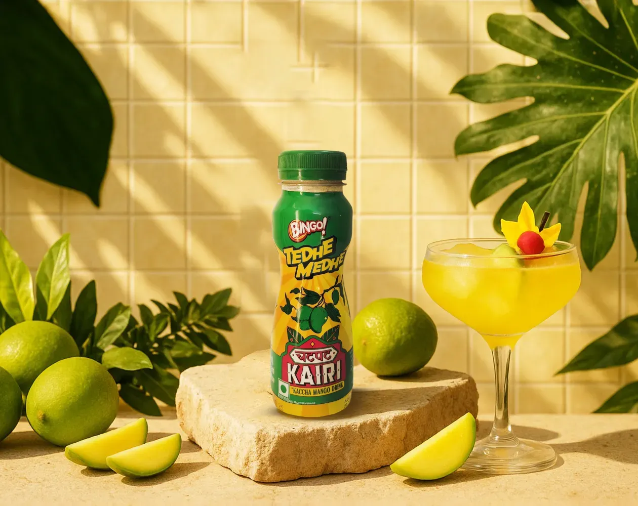
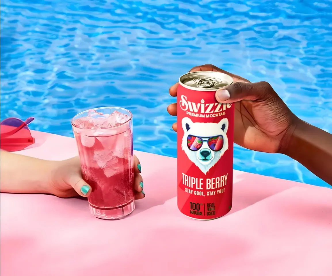
We worked with Bingo (by ITC) to help them launch India’s next viral beverage; Aam Panna
%201.webp)
Global award-winning Identity & packaging design for US's health & lifestyle startup AIM Nutrition
-p-2000%201.webp)
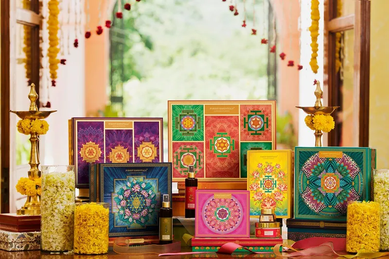
Building India’s fastest growing D2C supplements brand, Miduty by redesigning their branding, packaging & e-commerce website
Mood boards help set direction before anything is designed. They allow everyone involved to agree on the emotional and visual cues the brand should lean into, so design decisions aren’t driven by personal taste or last-minute interpretation. Without this step, identity work often becomes reactive, with feedback pulling the visuals in different directions because the underlying intent was never aligned.
You can see this approach in brands like Skims, which uses mood boards early on to define softness, intimacy, and minimalism before moving into execution. At Confetti, mood boards are typically developed over three to five days and act as a bridge between strategy and design. If you want to make sure your visual direction is rooted in strategy rather than preference, this is something our team can walk you through in a short discussion.
General inspiration boards are often about collecting things that look good. Mood boards, when done properly, are about making decisions. They’re built to guide the work that follows, not just to merely decorate a presentation. Every image, texture, and reference is chosen for a reason, tied back to what the brand is trying to communicate. Without that intent, inspiration stays subjective and doesn’t translate into consistent design.
A good reference is Aesop. Its mood boards are rooted in restraint and intellect, not trends or visual novelty, which is why the brand feels so cohesive across touchpoints. At Confetti, mood boards are always anchored in positioning and brand archetype, so they act as a clear point of alignment for design teams. If you’re sitting on a folder of inspiration but unsure how to turn it into direction, this is something we can help you work through together in a short conversation.
For a single brand positioning, it’s usually enough to explore two to three distinct mood boards. This gives the team room to test different visual territories without losing focus or creating unnecessary confusion. Too few options can feel limiting, while too many often slow down the decisions and blur the direction. The aim is to explore meaningfully, not endlessly.
Many D2C brands approach this by testing one safer direction alongside one that pushes a little further, then seeing which feels right for the brand’s ambition. At Confetti, this kind of exploration is typically completed in under a week, keeping momentum intact. If you’re unsure how much exploration is actually useful for your brand, it’s often helpful to talk it through with someone who’s been through the process many times and can help you strike the right balance.
A strategic mood board goes well beyond images. Alongside visual references, it should include tone words, typography direction, colour mood, and basic visual rules that guide how everything comes together. These elements help designers understand not just what the brand might look like, but how it should behave visually. Things like spacing, hierarchy, and texture often matter as much as imagery, especially for brands that rely on restraint rather than decoration.
You’ll see this approach in brands like Minimalist, where mood boards often communicate restraint through white space, structure, and repetition rather than obvious visuals. At Confetti, we treat mood boards as design blueprints rather than collages, so they actively inform decisions instead of sitting on the sidelines. If you’re curious how this works in practice, we can walk you through our structure and thinking in a short conversation with the team.
Mood boards should be developed once positioning and brand archetype are locked, and before any logo or identity execution begins. This is the point where strategic thinking needs to be translated into visual direction. When the mood is defined too late, design decisions often have to be reworked because the emotional intent wasn’t agreed upon upfront. Setting this foundation early helps the identity develop with purpose rather than guesswork.
Brands like Glossier followed this approach by establishing mood and visual sensibility before moving into execution, which is why its identity feels consistent and intentional across every touchpoint. At Confetti, mood boards are created in Week 1 of identity design, acting as the reference point for everything that follows. If you’re unsure whether your process is sequenced correctly, a quick conversation can help sense-check the order and avoid unnecessary backtracking later.


Lorem ipsum dolor sit amet, consectetur adipiscing elit. Suspendisse varius enim in eros
Lorem ipsum dolor sit amet, consectetur adipiscing elit. Suspendisse varius enim in eros
Lorem ipsum dolor sit amet, consectetur adipiscing elit. Suspendisse varius enim in eros
.svg)
.svg)


.svg)
.webp)


.webp)


.webp)


.webp)