%201.webp)
02
AI Snaps
.svg)
.svg)
01
Our Work

03
About Us
05
Contact Us
06
Client Success

07
Blogs
08
Careers
Book A Call


Packaging design is where branding meets reality. It is the moment a customer finally holds the brand in their hands, and more often than not, it is the moment that determines whether they buy, come back, or quietly move on to the next option on the shelf.
For many Indian brands, packaging has been the single biggest driver of discovery and recall. Paper Boat built an emotional connection through illustration before most people had even tasted the drink. The Whole Truth made transparency a design principle, not just a brand value. Blue Tokai's restrained, confident bags communicated craft in a category drowning in loud, undifferentiated packaging. Epigamia, Sleepy Owl, Kapiva, each found their footing in crowded categories partly because their packaging gave consumers a reason to pause.
That is what good packaging does. It communicates value before a word is read, builds trust before a product is tried, and creates the kind of shelf presence that advertising budgets alone cannot buy. In retail, packaging carries the weight of marketing, storytelling, and differentiation all at once. A strong product in weak packaging will always struggle to scale. And a well-designed pack can do more for a brand in six months on shelf than a year of social media campaigns. At Confetti Design Studio, this is not a philosophy we recite, it is the very standard we hold every packaging project to.

Packaging design is the process of deciding how a product is presented, physically and visually, to the person picking it up. That means the structure of the pack, the materials it is made from, and the complete visual system applied across every surface, not just the face that gets photographed for Instagram.
Visually, packaging brings together imagery, typography, colour, layout, and information hierarchy to answer three questions quickly: what is this, who is it for, and why should I care. The brands that do this well make it look effortless. The Whole Truth uses plain typography and honest layouts because the brand is built on transparency, and the packaging reflects exactly that. Paper Boat leans on illustration and memory because the product is about nostalgia, and every surface of the pack reinforces that feeling. Blue Tokai says almost nothing on its bags, and that restraint communicates more about quality and confidence than a hundred descriptors would.
These are not just design choices. They are strategic decisions that happen to express themselves visually. Effective packaging balances shelf impact with clarity, compliance with character, and practicality with personality. And it needs to feel like the brand without the brand name even being visible.

At Confetti, packaging is treated as a complete experience, not a flat visual to be signed off and sent to print. The process runs across three interconnected layers, each of which shapes the final outcome.
A pack is not experienced in a single glance. It is touched, turned, opened, and interacted with over time. We design for that entire journey, from the moment someone picks it up to what they find when they open it. How does it open? What does the customer see first? How does information reveal itself as they move around the pack? We apply a structured four-point unboxing framework to make sure none of this is left to chance, and that every interaction feels considered and on-brand.
The material a pack is made from is not a procurement decision. It shapes how the product feels in the hand, how it reads on shelf, how sustainable the brand comes across, and whether the visual system applied to it actually works in real life. We work with clients to identify materials that fit their positioning and their practical requirements, whether that means a premium tactile finish, an eco-conscious substrate, or a cost-efficient solution built for volume. These decisions are made alongside the design, not after it.
We design across all surfaces of the pack because every surface is a brand moment. The front of pack is designed for attention and shelf impact. The sides carry continuity, supporting communication, and brand character. The back handles compliance, ingredient information, legal requirements, and the detail that builds trust with a more considered buyer.
Typography, imagery, spacing, and hierarchy are balanced across all of these surfaces so the pack holds together from every angle, not just the hero shot. And everything we produce, from the earliest sketch to the final print-ready artwork, is original and fully owned by the client.
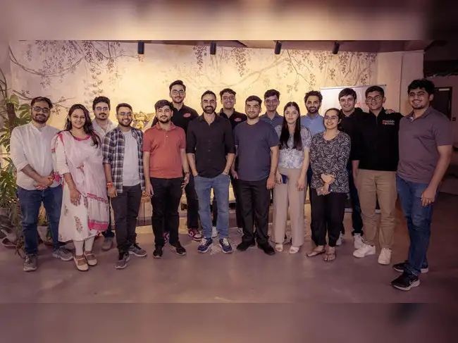
Confetti’s team is trusted by global leaders, and it’s time we join forces with you to create your Iconic brand!
Tap the button below and talk to our founders directly.
.webp)

Many packaging designs fail not because they look bad, but because the process is shallow. Some of the most common issues include:
Confetti’s approach is designed to avoid these pitfalls. By going deeper into experience, material, structure, and strategy, we create packaging that not only stands out visually but also performs commercially and holds up over the course of time.

In FMCG and retail, packaging is the one brand touchpoint that never takes a day off. It is on shelf, in homes, in unboxing videos, in delivery bags, and in the hands of every customer the brand reaches. No campaign works that consistently or that quietly.
The demands on packaging have also multiplied. A pack today needs to perform on a physical shelf, as a thumbnail on a quick commerce app, in a content creator's unboxing video, and in the hands of someone opening it for the first time. Each of those contexts asks something slightly different of the design, and packaging built without that breadth of thinking tends to underperform somewhere along the line.
At Confetti, packaging is never designed in isolation. It is built from the same positioning, archetype, colour system, and visual language established earlier in the brand identity process. That foundation is what makes the difference between packaging that looks like the brand and packaging that actually is the brand, consistently, across every context it appears in.
Every packaging project at Confetti is shaped by the specific brand, category, retail environment, and consumer we are designing for. There is no standard template, no default approach, and no recycled solutions. What we bring is strategic depth, genuine category knowledge, and a design process rigorous enough to hold up commercially, legally, and creatively over the long term. If you are launching something new, extending a range, or working with packaging that is not performing the way it should, that is the conversation worth having. Get in touch with Confetti to talk about packaging design for your category.
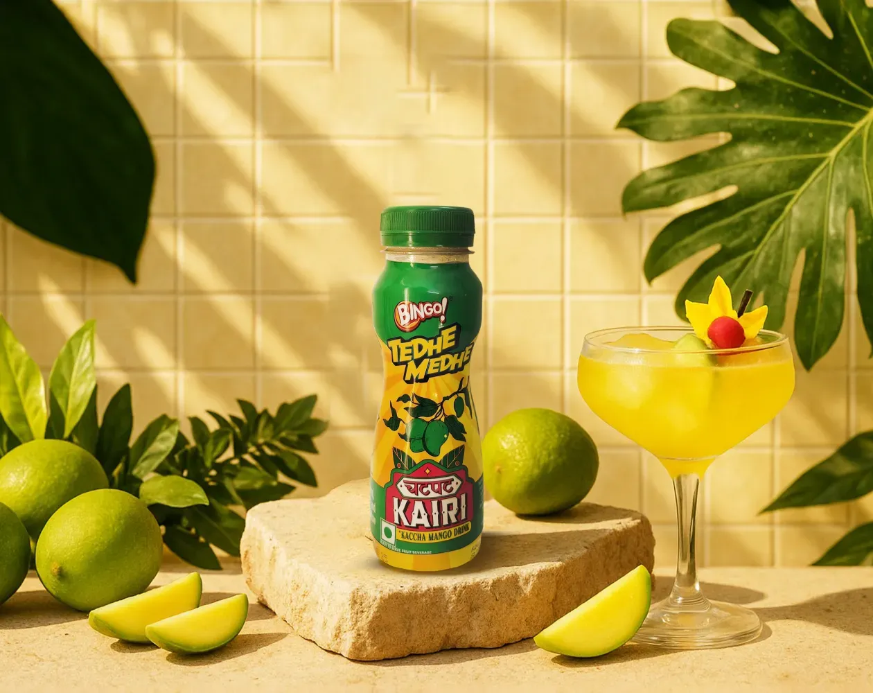
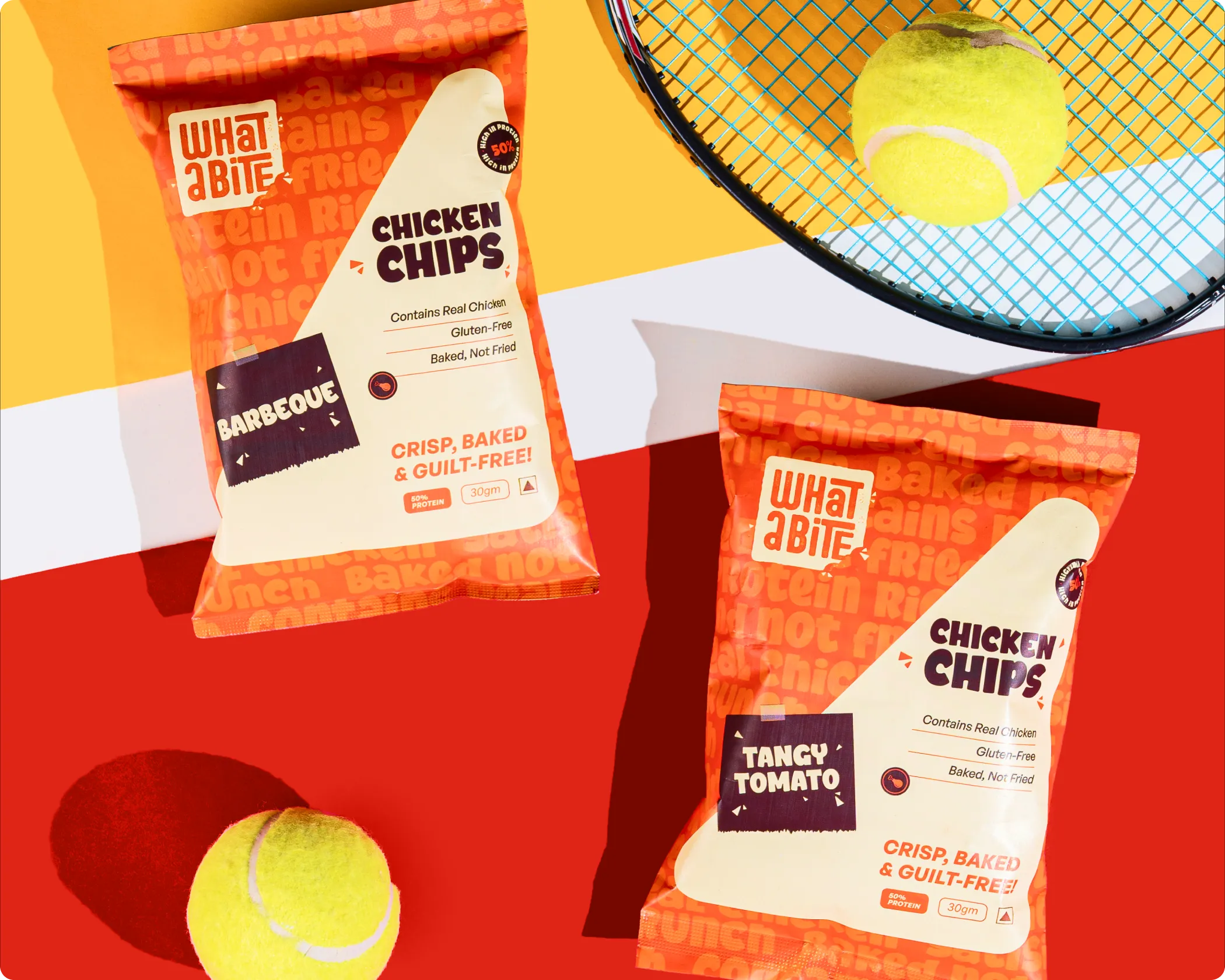
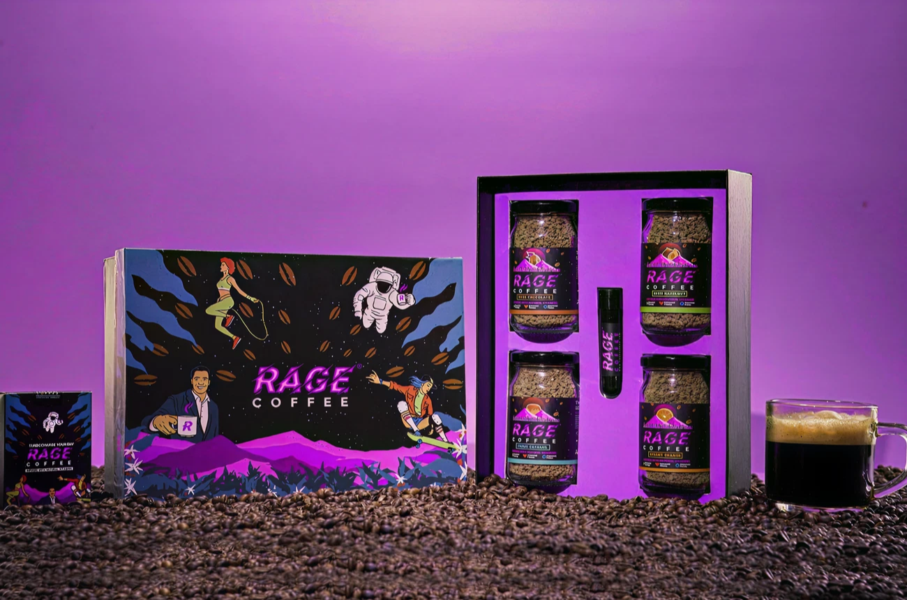
We worked with Bingo (by ITC) to help them launch India’s next viral beverage; Aam Panna
%201.webp)
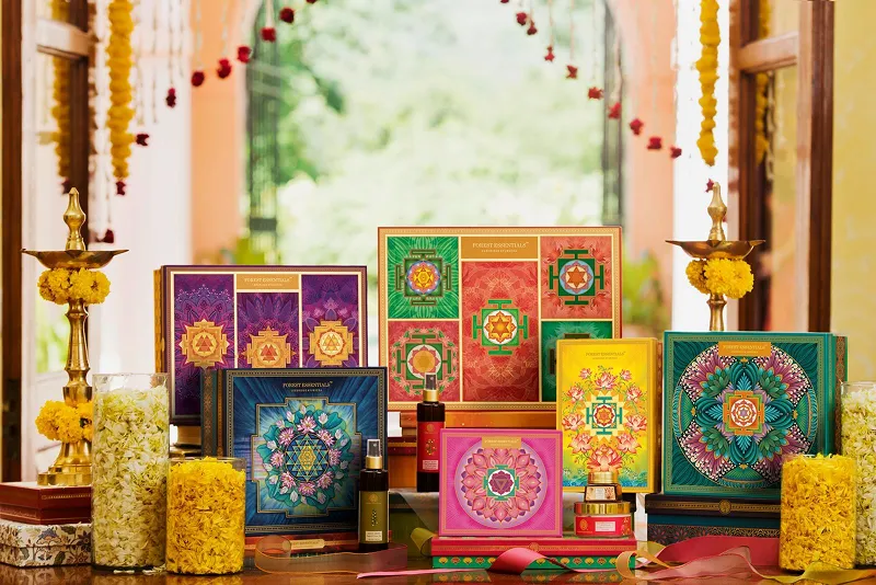
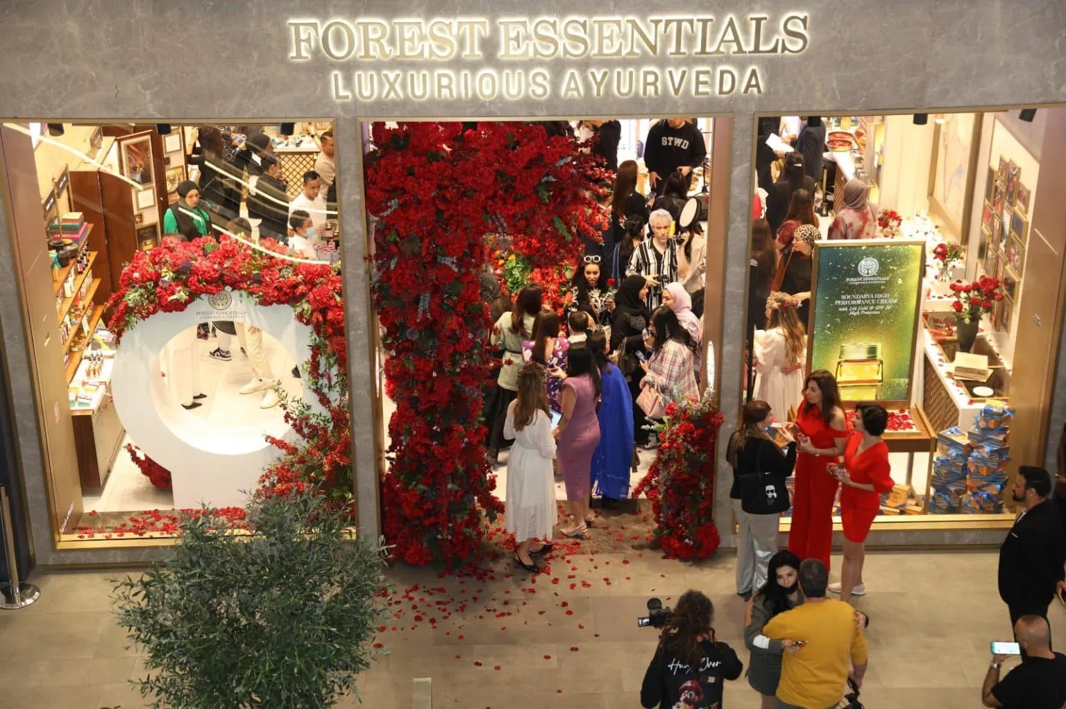
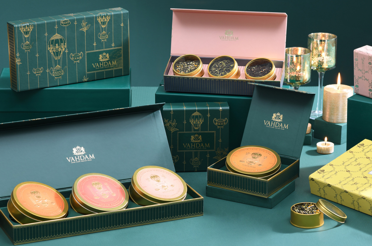
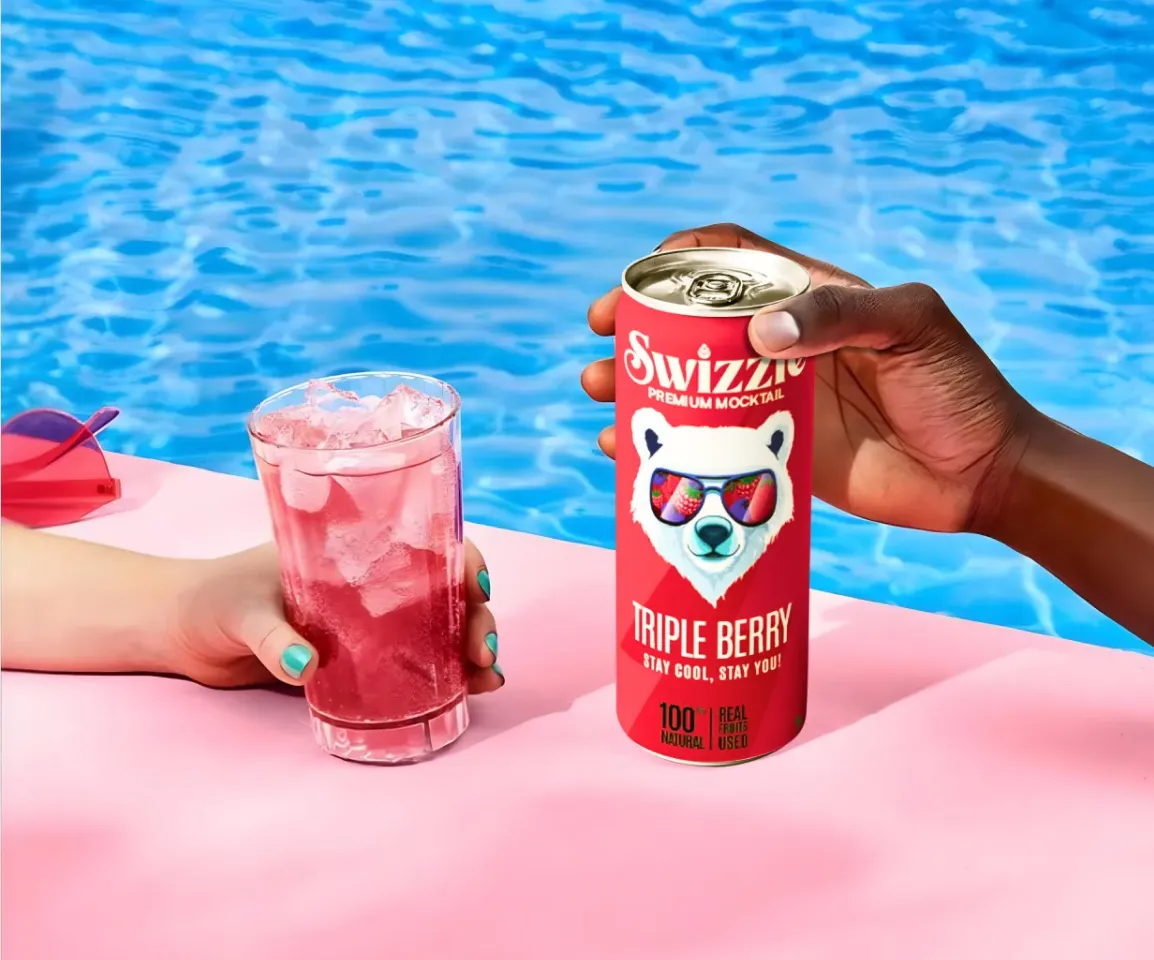
Global award-winning Identity & packaging design for US's health & lifestyle startup AIM Nutrition
-p-2000%201.webp)
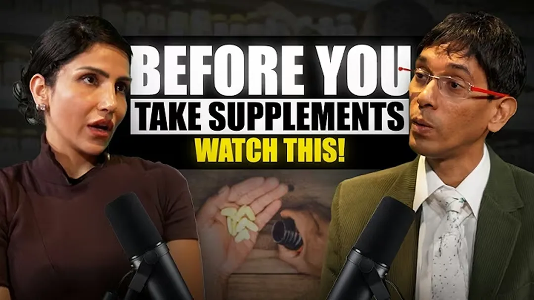
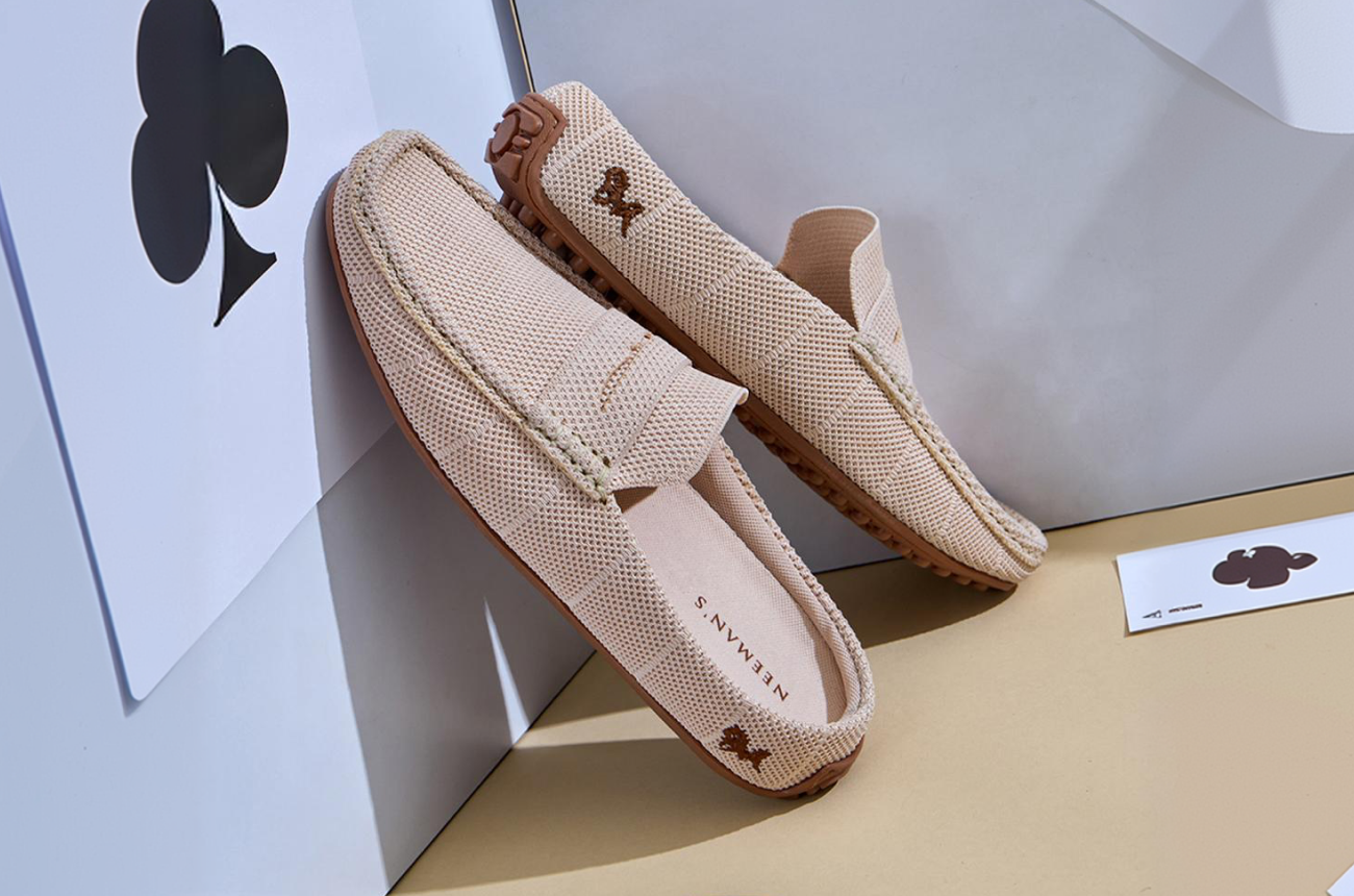
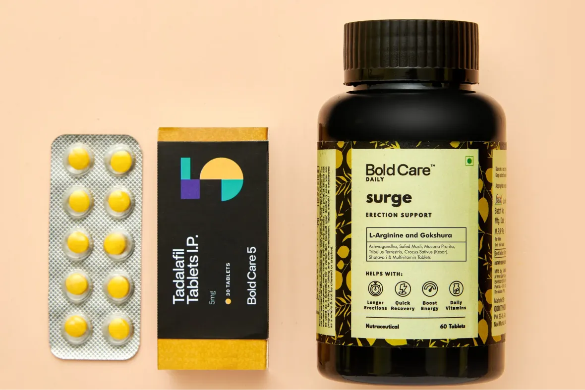
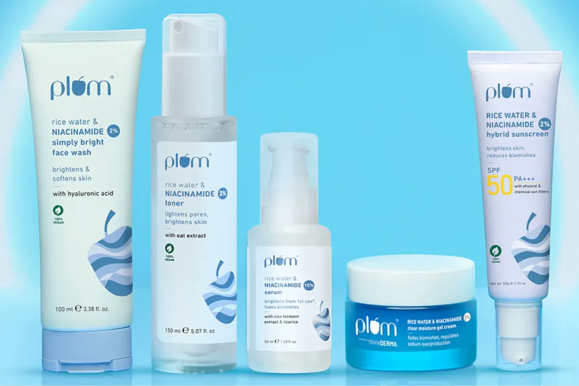
Building India’s fastest growing D2C supplements brand, Miduty by redesigning their branding, packaging & e-commerce website
In most retail settings, packaging is doing the selling on your behalf. It’s often the first interaction a customer has with the product, and sometimes the only one before they decide whether to pick it up or move on. In those few seconds, packaging has to earn attention, signal value, and create the right emotional response. Whether that emotion is trust, excitement, reassurance, or indulgence depends entirely on what the customer is looking for in that moment.
At Confetti, we build packaging with this reality in mind from Day 1. Every decision is tied back to what the product needs to communicate when no one is there to explain it. This helps ensure the pack works hard on the shelf, not just in mockups. If you want to understand whether your packaging should lead with standout appeal or quiet confidence, getting on a short call with our team will help us assess where your product truly wins.
Packaging design goes far beyond what’s visible on the front panel. Customers pick up packs, turn them around, read side panels, check ingredients, look for reassurance, and notice how information is prioritised. Material choice, structure, finishes, legal text, hierarchy, and information flow all shape how the product is experienced. If these elements aren’t considered together, the packaging may look good at first glance but feel confusing or untrustworthy in hand.
At Confetti, we design packaging as a 360° system, typically over two to three weeks, so every surface has a clear role to play. This includes thinking through how the pack is held, where the eye naturally moves, and what information needs to land first versus later. If you’d like to walk through how customers actually interact with your pack in real life, hopping on a quick call with our team is the best way to map that experience properly.
Balancing shelf impact truly comes down to assigning clear roles to each part of the pack. The front of the pack is there to attract attention and communicate the brand at a glance. It’s about emotional pull and visibility in a crowded environment. The side panels do the heavier lifting when it comes to differentiation and product communication, helping customers understand what makes the product right for them. The back of the pack is where legal and regulatory information lives, organised in a way that’s clear and easy to navigate.
This structured thinking is what we call the Confetti way. By defining what each surface is responsible for, creativity doesn’t compete with usability or compliance. It supports it. If you’re trying to strike the right balance between standing out on the shelf and meeting real-world requirements, getting on a short call with our team can help you see how this approach would work for your product.
Material selection needs to be part of the conversation early, not something tacked on at the end. The material you choose affects far more than just how the pack feels. It influences structure, colour accuracy, finishes, cost, sustainability, and even how the product is perceived on the shelf. Designing without considering material often leads to compromises later, when great ideas have to be adjusted to fit manufacturing reality.
You can see how intentional this can be with Aesop. Its material choices reinforce its thoughtful, premium positioning just as much as its visuals do. At Confetti, we discuss materials before the final artwork is locked in, so design and production are working together rather than against each other. If you want to align your design ambition with what’s actually feasible to produce, hopping on a short call with our experts is the most practical way to do that early on.
Original packaging comes from understanding the category before trying to stand apart from it. We start with category audits and originality checks to see what’s already out there, what visual cues are overused, and where brands are starting to look too similar. This helps avoid accidental imitation, which is where many D2C brands run into trouble. When visual language is copied too closely, it doesn’t just dilute differentiation, it can also lead to legal challenges once the brand starts scaling.
At Confetti, we design packaging as a system rather than a one-off look. That system is built with legal safety and long-term scalability in mind, so it can stretch across formats, SKUs, and markets without losing integrity or inviting risk. Legal compliance isn’t treated as a checkbox at the end, it’s a core design principle from the start. If you want to pressure-test your packaging for originality and future readiness before launch, getting on a short call with our experts can help spot issues early and save costly revisions later.


Lorem ipsum dolor sit amet, consectetur adipiscing elit. Suspendisse varius enim in eros
Lorem ipsum dolor sit amet, consectetur adipiscing elit. Suspendisse varius enim in eros
Lorem ipsum dolor sit amet, consectetur adipiscing elit. Suspendisse varius enim in eros
.svg)
.svg)


.svg)
.webp)


.webp)


.webp)


.webp)