%201.webp)
02
AI Snaps
.svg)
.svg)
01
Our Work
03
About Us
04
Brand Audit
05
Contact Us
06
Client Success
12
07
Blogs
08
Careers
Book A Call
.svg)




Need Help In Building Your Brand?
Click the button below & book a call with our founder directly.

Rishabh Jain
Managing Director
Kama Ayurveda | Confetti's Verdict ⭐⭐⭐
Confetti Design Studio has analysed Kama Ayurveda to understand why a brand that helped build the luxury Ayurveda category is now shrinking while its closest rival grows.
Kama posted ₹141 Cr in FY25, down at a -16% CAGR, at the same time as Forest Essentials crossed ₹585 Cr with 18% growth and moved into full Estee Lauder ownership. Vivek Sahni co-founded the brand in 2002 after learning traditional formulations from an Ayurvedic guru in Kerala, and Puig, the Spanish beauty major behind Charlotte Tilbury and Rabanne, has held a majority stake since 2022.
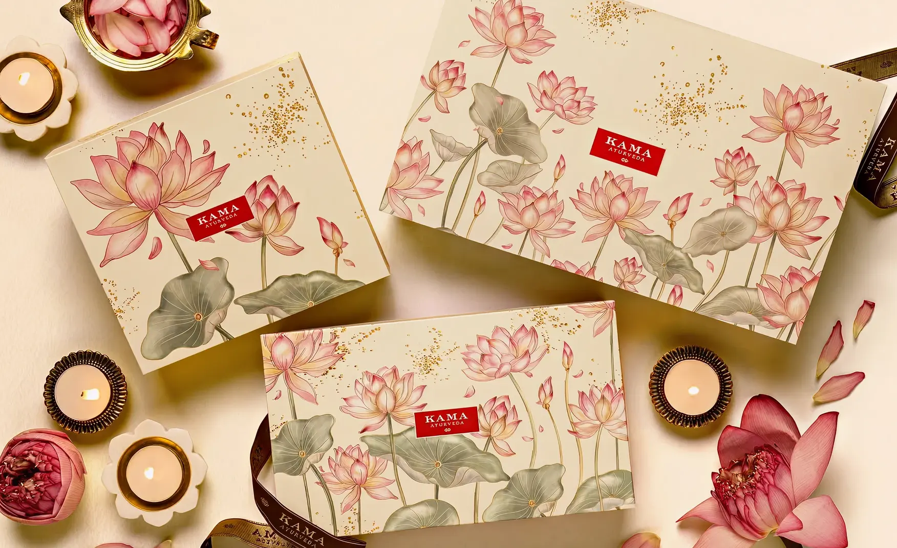
Every product on the shelf reads as unmistakably Kama.
The amber glass bottles, the gold caps and the serif type work together to signal Ayurveda without a single word of explanation. The outer cartons carry illustrations that tie back to the same visual world, so a customer picking up any product from the range recognises the brand immediately.
This is packaging built by people who understood shelf presence long before Instagram made it fashionable. It also does the harder job of surviving a size change, since a full-size bottle and a travel size still look like they belong to the same family rather than a scaled-down afterthought.
Puig is one of the most credible operators in luxury beauty anywhere in the world.
It runs Charlotte Tilbury, Rabanne and Jean Paul Gaultier, and it took a majority stake in Kama Ayurveda in September 2022 after first investing as a minority partner back in 2019.
On paper, this gives Kama access to fragrance expertise, retail infrastructure and export routes that most Indian beauty brands never see. The brand has already used that support to open stores in the United Kingdom, including at Harrods and in Notting Hill.
Puig posted group sales of over 3.6 billion euro the year of the acquisition, which is the scale of partner most homegrown Indian beauty brands simply cannot access on their own.
That scale is meant to be an accelerant, not a distraction, and the next few years of Kama's numbers will show which one it has actually been.
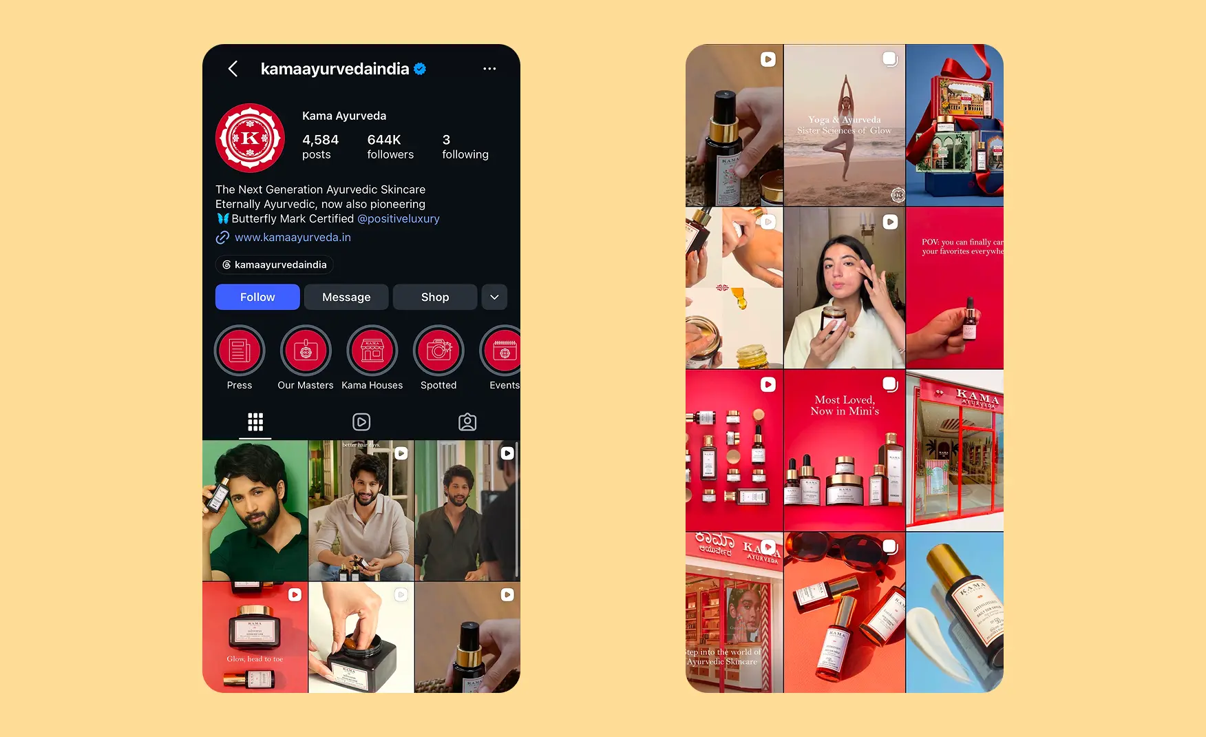
Kama Ayurveda's Instagram sits at around 6,44,000 followers and posts often, which is no small feat to keep on brand.
The content mixes user generated posts, founder appearances and a celebrity face in Rohit SaraF, all wrapped in a consistent red highlight system.
The brand has resisted chasing random trends, and that restraint is exactly what builds long-term trust in a wellness category. Store openings and behind-the-scenes shoot content add texture without breaking the tone.
An education-led approach, with the brand's own experts and the founder explaining formulations & brand story on camera, gives the feed a credibility that pure product photography never manages on its own.
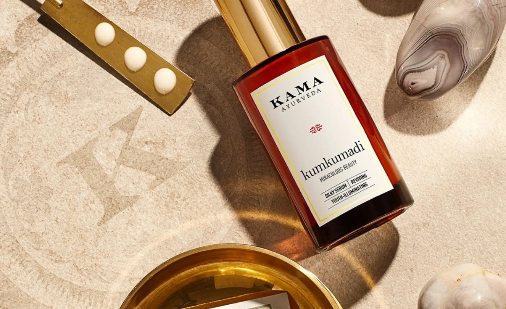
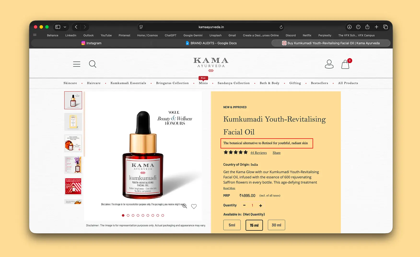
The Kumkumadi Youth-Revitalising Facial Oil is Kama's clearest asset in the whole portfolio.
It carries a Vogue Beauty and Wellness honour and a one-line claim, "the botanical alternative to retinol for youthful radiant skin," that is easy to repeat and easy to believe.
A brand with one product people can name and quote back is rarer than it sounds, and Kama has that in Kumkumadi. Most Indian beauty brands are remembered by category rather than by a single hero, and Kumkumadi gives Kama exactly the kind of word-of-mouth shorthand that harder-to-copy brands rely on.
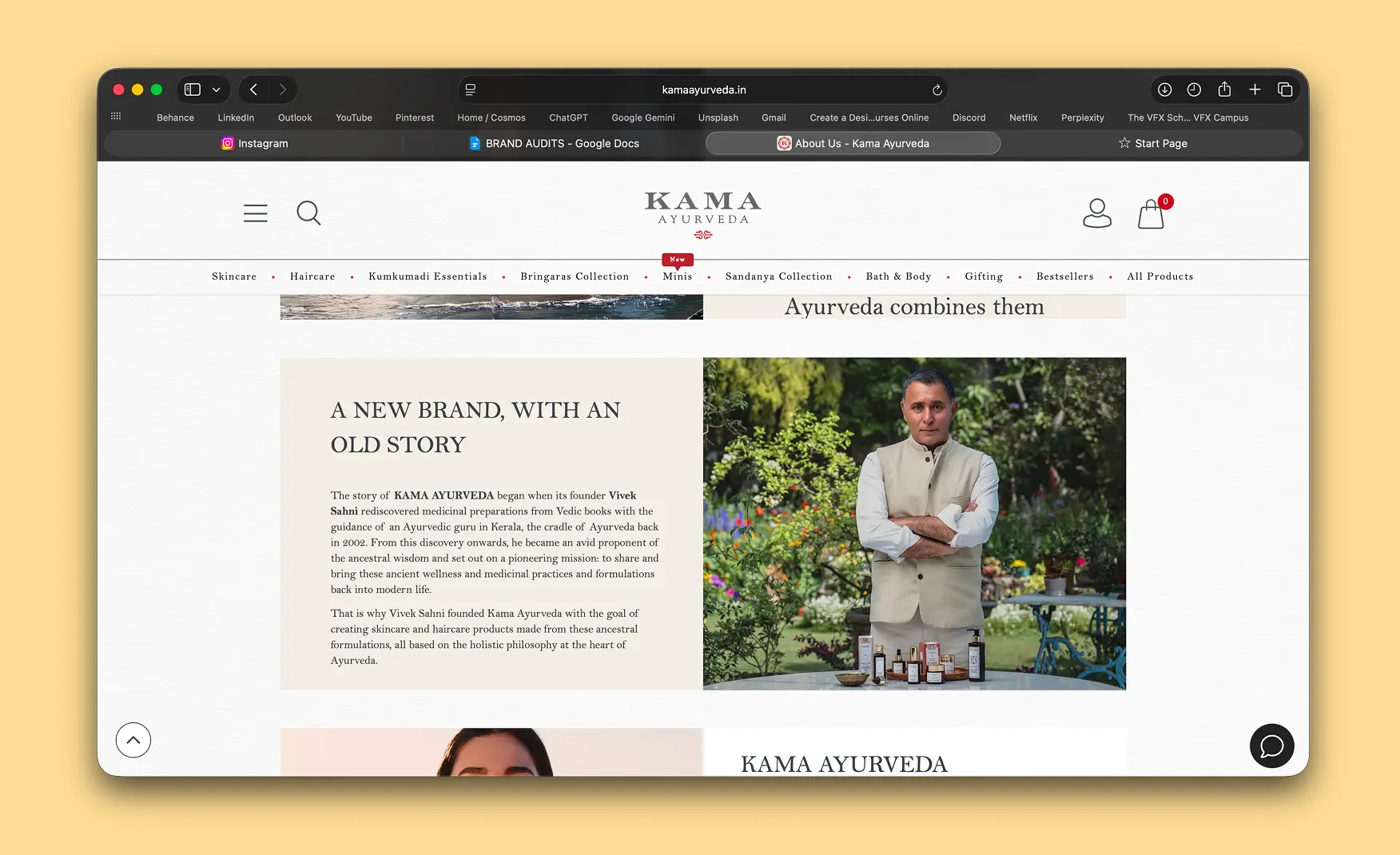
The About Us page tells a specific, human story rather than a written-by-committee mission statement.
Vivek Sahni learned traditional formulations from an Ayurvedic guru in Kerala in 2002, working from old manuscripts rather than a lab brief.
That origin gives the name itself real meaning, with Kama standing for desire and life energy and Ayurveda for the wisdom of nature. The brand also ties its manufacturing to Arya Vaidya Pharmacy, a hundred-year-old Coimbatore institution, which gives the origin story a manufacturing partner that cannot be manufactured after the fact.
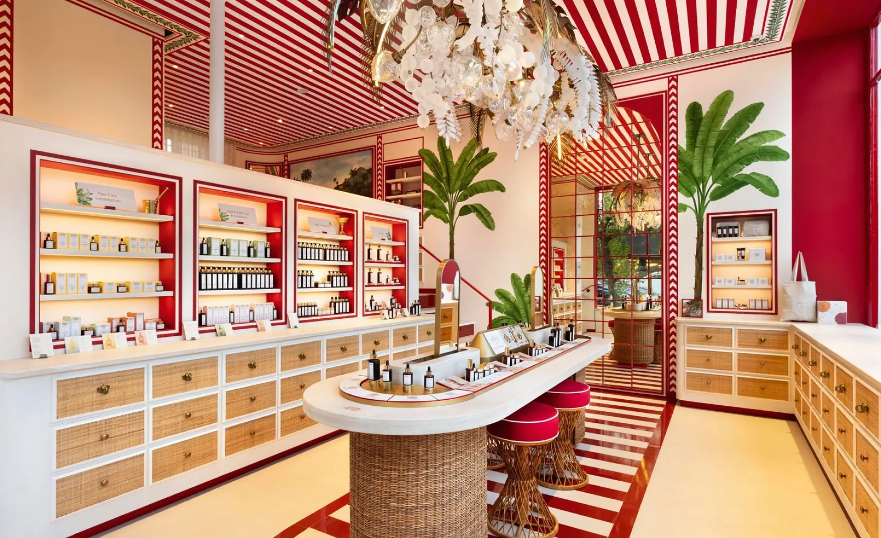
Kama runs around 65 exclusive stores across India, plus a presence in premium hotels and spas including Oberoi and Taj properties.
That physical footprint gives the brand a gifting occasion that many D2C-only competitors simply do not have. Walking into a Kama store feels elegant, from the shelving to the scent, and that in-person impression is doing real work that the website currently fails to carry online.
Kama's revenue has fallen at a -16% CAGR to ₹141 Cr in FY25, and EBITDA has fallen even faster.
Forest Essentials, the brand Kama once competed with as a near equal, closed the same year at roughly ₹585 Cr with 18% growth and a full move into Estee Lauder ownership.
That gap did not exist five years ago, and it raises real questions about what went wrong inside the Puig integration, distribution or product development. Whatever the exact cause, a category leader losing ground while the market itself keeps growing is the single most urgent fact in this entire audit.
Kama's products sit in the ₹2,000 to ₹4,000-plus range, yet the website reads like a plain, generic template.
There are no visible reviews on product listings, which is a real trust gap for a brand charging luxury prices. The homepage offers short snippets instead of real storytelling about sourcing or process, and there is little of the gold accenting or premium detail that the packaging already does so well.
The brand's own social content, including its red highlight system and store imagery, is completely absent from the site experience. For a shopper comparing a ₹3,500 face oil against a global prestige brand, the website is often the deciding factor, and right now it is not pulling its weight.

The Kama Ayurveda logo is a clean, minimal wordmark and nothing more.
Cover the name and there is no separate mark left behind, unlike Forest Essentials, which has built recognisable visual shorthand beyond its type.
A distinctive icon or symbol would give the brand something to recognise at a glance, rather than relying on the name alone in every touchpoint. At 65 stores and growing internationally, that gap becomes more expensive to fix with every new opening.
Kama is now stretching across India, the United Kingdom and hotel partnerships in multiple markets at once.
Each new market adds pressure to keep the same story consistent without a strong enough digital or identity foundation underneath it. Growing the footprint before fixing the website and the mark risks scaling the exact same weaknesses, rather than fixing them before they multiply.
Kama was built on a deeply Indian, Ayurvedic identity, and Puig's wider portfolio sits mostly in Western fragrance and fashion-adjacent beauty.
That mismatch may be showing up directly in the revenue line, and closing it means leaning harder into what makes Kama unmistakably Indian rather than smoothing it into a more generic luxury template.
The brands winning in Ayurvedic beauty right now are the ones that treat the science and the sourcing as the actual story, not as background texture behind a Western luxury playbook.
Confetti's work on brands into the ayurvedic and skincare niche taught us that an Ayurvedic brand earns trust through a tone that feels plain & unhurried.
Kama's website needs the same discipline applied to storytelling, reviews and lifestyle imagery, so the site finally matches what the packaging and social channels already do well. Even small additions, like verified reviews on the Kumkumadi listing or a proper sourcing story on the homepage, would close a large part of this gap quickly.
A brand this well established in packaging deserves a visual mark that works independently of its wordmark.
Investing in one piece of ownable identity now would do more for recall than any single campaign, and it is a gap Confetti sees clearly from the outside. International expansion is the ideal moment to introduce it, since every new market gives the mark a fresh audience to build recognition with from day one.
Kama Ayurveda built the template for what luxury Ayurveda looks like in India, and its packaging, hero product and social presence still prove that.
What holds it back is a website that undersells the price point, a logo that does not carry its own weight, and a revenue line moving in the wrong direction while its closest rival gets bought outright.
If you are building a luxury wellness or Ayurvedic brand and want your digital experience to match the strength of your packaging, get in touch with Confetti Design Studio.
Want strategic branding and packaging like this for your business?





.webp)
.webp)


.webp)
.webp)
.webp)
.webp)
.webp)







.svg)
.webp)





.svg)
.svg)







































































.webp)







.webp)


.svg)