%201.webp)
02
AI Snaps
.svg)
.svg)
01
Our Work
03
About Us
04
Brand Audit
05
Contact Us
06
Client Success
12
07
Blogs
08
Careers
Book A Call
.svg)




Need Help In Building Your Brand?
Click the button below & book a call with our founder directly.

Rishabh Jain
Managing Director
Fenty Beauty | Confetti's Verdict ⭐⭐⭐⭐ ½
Confetti Design Studio has analysed the packaging design, naming architecture and channel strategy of Glow Recipe, the New York skincare brand behind a watermelon sleeping mask. That one product became one of the most photographed beauty products.
Sarah Lee and Christine Chang, both former L'Oréal executives, started Glow Recipe in 2014 with $50,000. For three years, they resold Korean skincare before finally launching their own product in 2017.
It now generates more than $300 million annually, remains majority owned by its founders after seven years, and stands as Sephora’s number one indie brand.
The audit looks at whether a brand built on such a distinctive look can actually keep it as its own. This audit is as per September 2026.
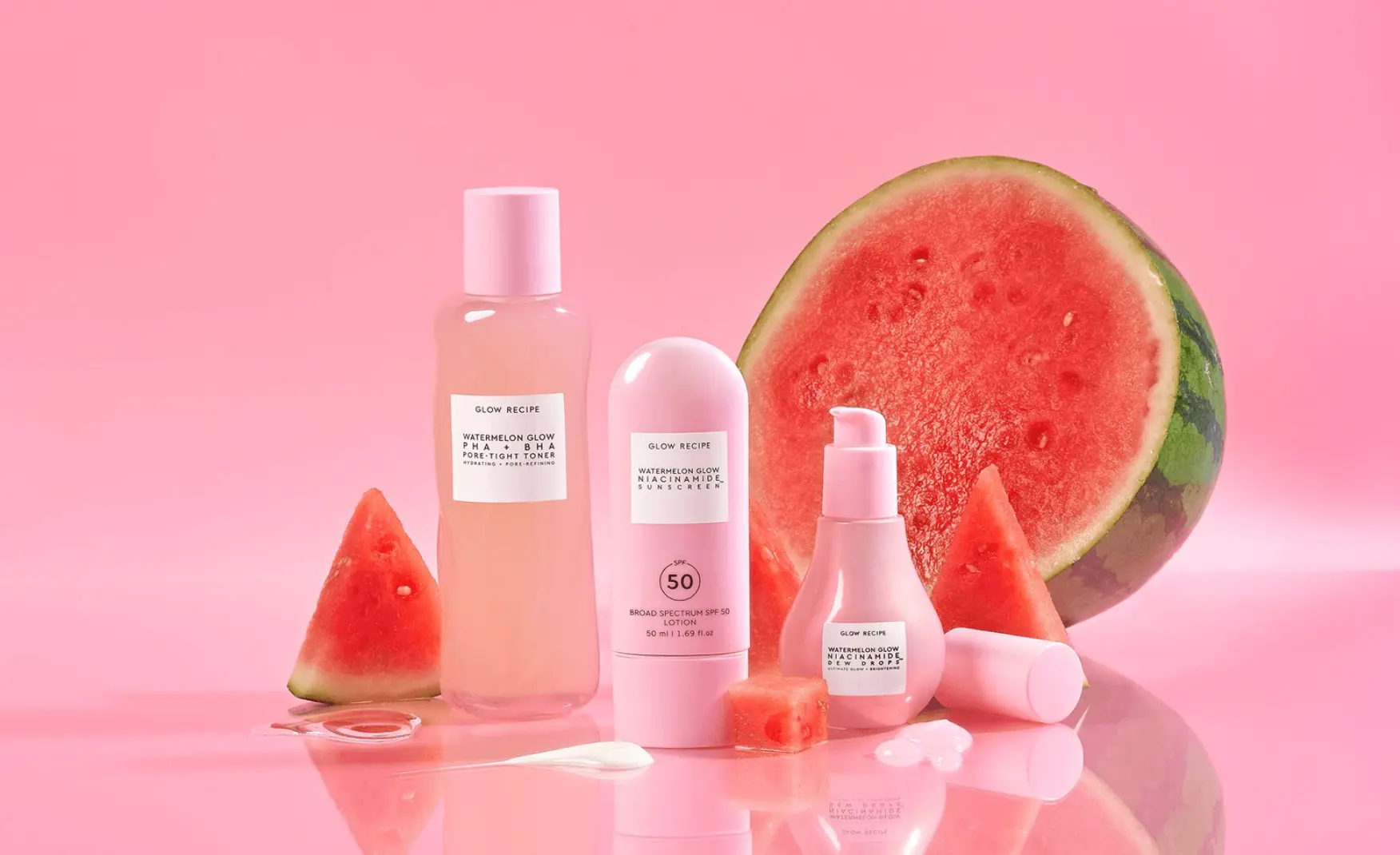
Usually, the packaging design starts with the shelf in mind, how a product looks sitting next to competitors in a store.
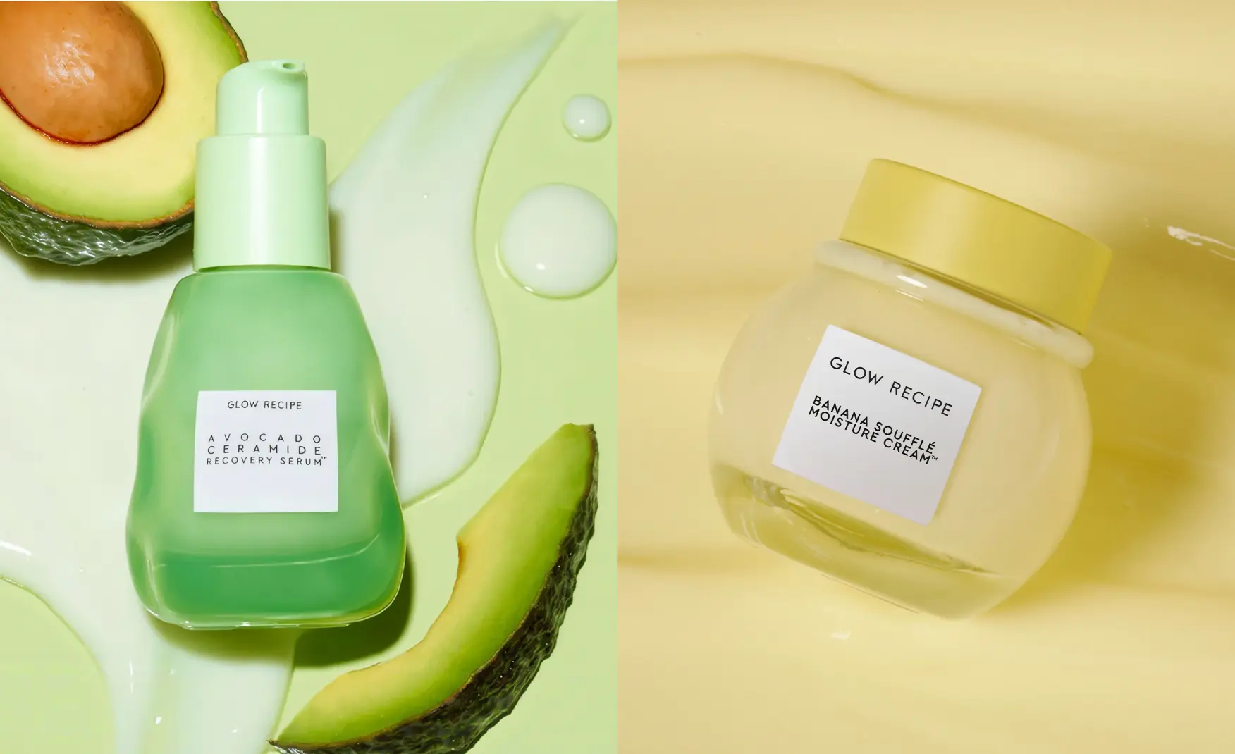
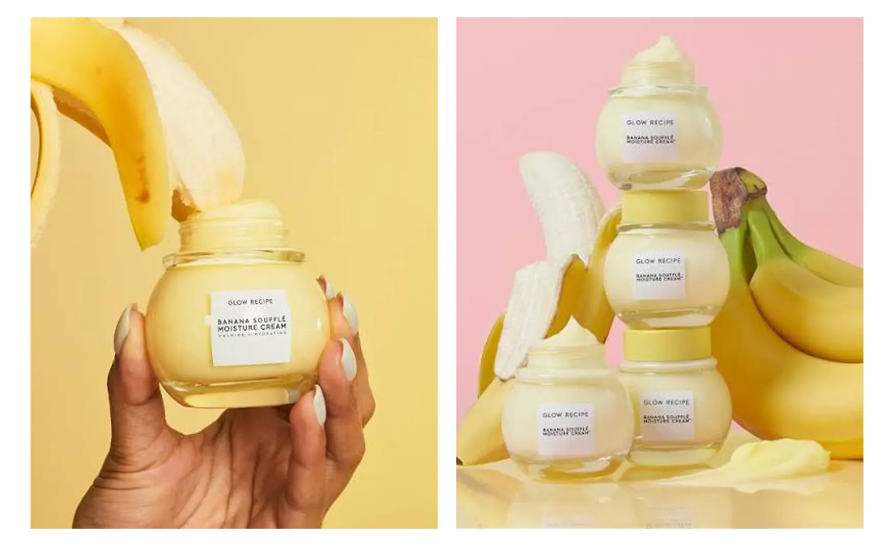
But Glow Recipe did the opposite. They formulated the Watermelon Glow Sleeping Mask to actually look like the inside of a watermelon, pink, juicy, almost edible, and whipped the Banana Soufflé Moisture Cream until its texture looked like dessert.
It was about getting attention on a phone screen, the moment someone opens the jar and can't resist filming it.
TikTok creator Mikayla Nogueira posted an unpaid video of the Dew Drops and Pore-Tight Toner and it reached 16 million views and drove a 600% spike in daily sales within four days.
A single organic moment later became the model the brand intentionally built its creator strategy around.
Glow Recipe launched in 2014 as a curation platform reselling Korean beauty imports and operated that way for three years before making anything of its own.
This means that Lee and Chang were watching real transactions rather than surveying intentions.
Lee and Chang learned which ingredients converted a Western consumer, and understood price sensitivity from their own sales data. And built direct relationships with Korean laboratories.
When they finally created the Watermelon Glow Sleeping Mask, they drew on childhood memories of grandmothers using watermelon rinds to soothe sunburn. And by the time it launched it created a huge demand.
Rishabh, the founder of Confetti Design Studio, has noticed that beauty naming generally fails in one of these two directions: it either goes clinical or abstract.
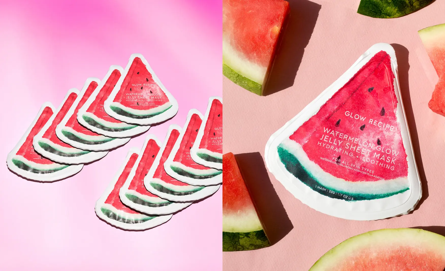
Glow Recipe paired a recognisable fruit with a named active in every product. Watermelon Glow, Plum Plump Hyaluronic Serum, Pineapple-C Bright Serum, so the fruit carries memorability and the active carries credibility.
The name “Glow Recipe" derives from, "glow" means the result everyone wants and "recipe" is how you get there.
It signals a feeling of the right ingredients combined in the right way.
So every product name is basically the brand keeping its own promise.
Watermelon Glow Niacinamide Dew Drops was named one of WWD’s 2026 Greatest Beauty Products of All Time. In a June 2026 test, the brand ranked number one for best dewy skin serum across all five major AI engines.
In 2015 the founders appeared on Shark Tank seeking $425,000 for 10% of the business.
Robert Herjavec offered the same amount for 30% of the company. Lee and Chang talked him down to 25%, then walked away from the deal. They protected the one thing that mattered most, their own judgment on which Korean ingredients would actually resonate with a Western audience.
The company then stayed bootstrapped for seven years, taking its first outside capital only in October 2021 from North Castle Partners, once the business was already at roughly $100 million.
The founders still own the majority of the company today, now valued at an estimated $500 to 600 million.
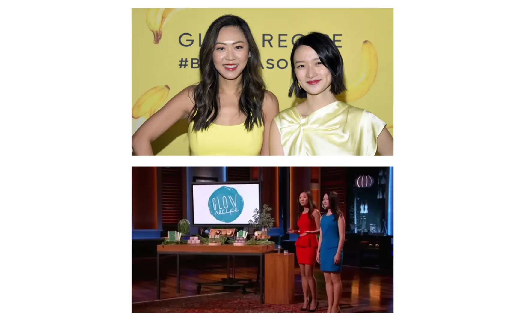
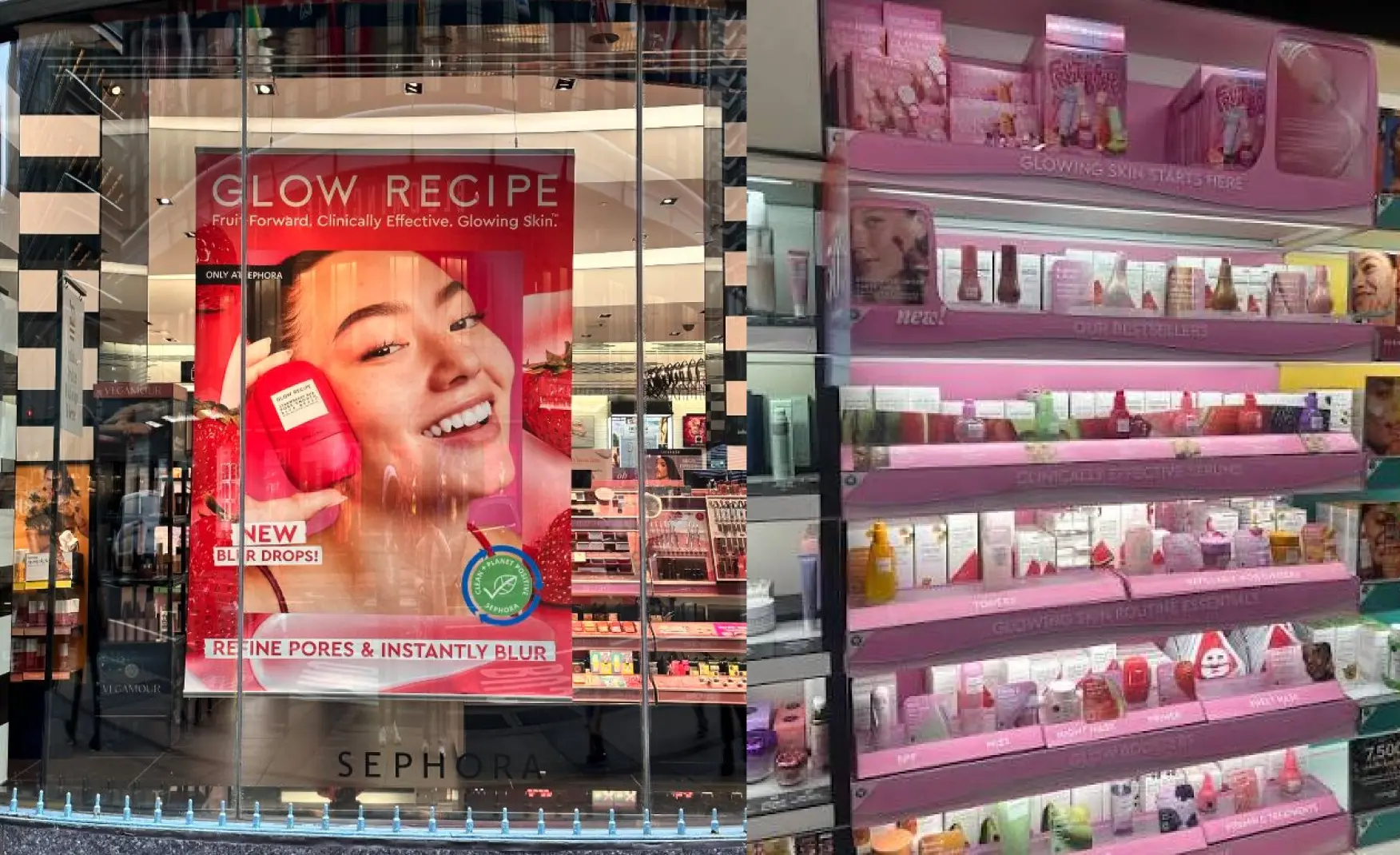
Glow Recipe has been Sephora’s exclusive US partner since 2017 and has declined Ulta, Target and wholesale, treating that refusal internally as a competitive asset.
The international strategy follows the same, expanding through Sephora's regional equivalents into 38 doors in Mexico, Blushbar in Colombia and Chile, and 14 European markets. By 2025, sales are expected to split roughly 54% North America and 46% international.
Prioritising geography over channel is a more careful growth route.This keeps the positioning intact while revenue doubles.
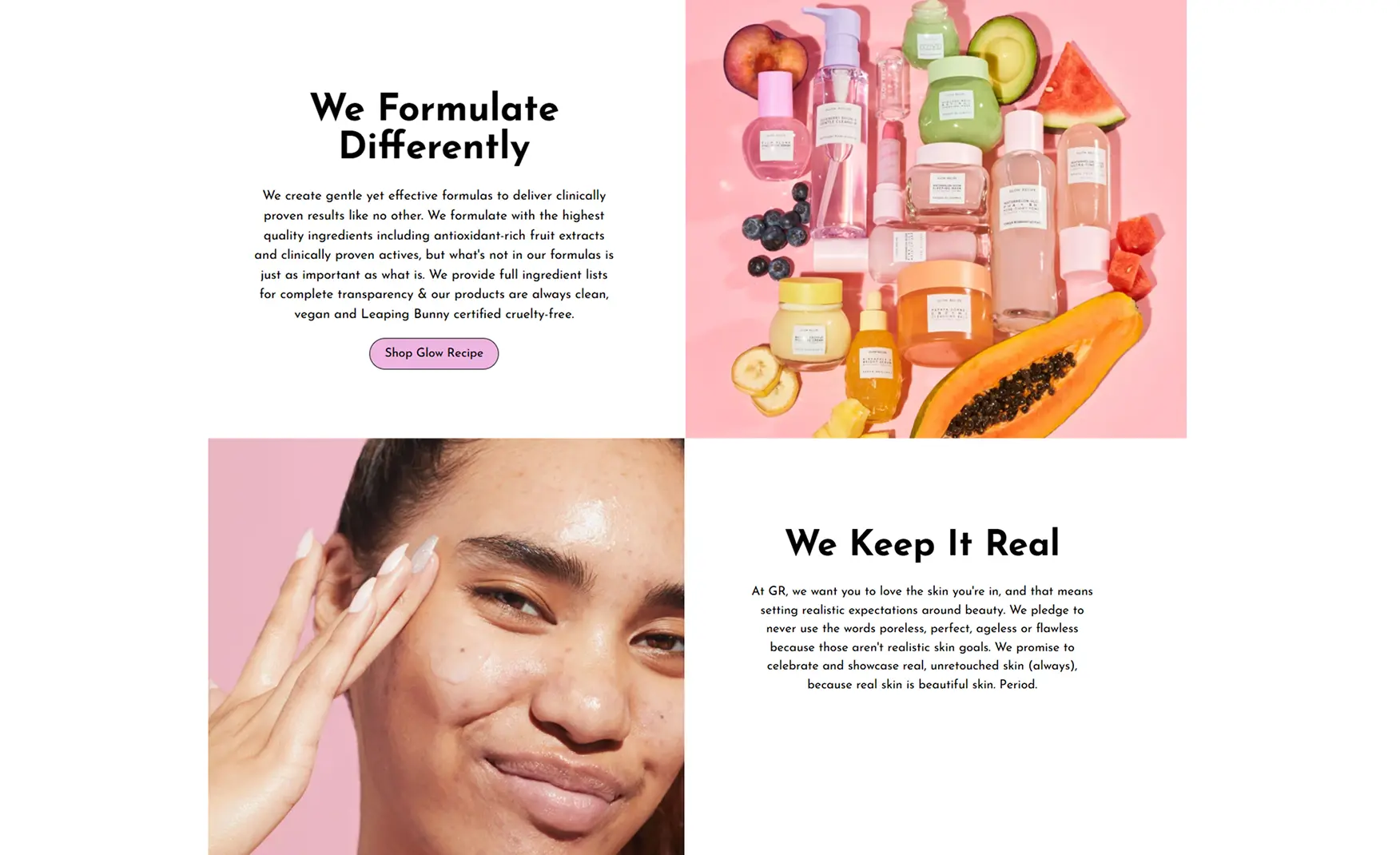
Glow Recipe’s stated belief is “day by day, skin by skin”. Meaning skin changes constantly over time rather than being one fixed problem to solve.
Within that belief, the fruit represents antioxidant-rich extract working alongside proven actives, with full ingredient lists. And vegan and cruelty free standards kept up throughout.
The brand has also pledged never to use the words like poreless, perfect, ageless or flawless, they chose real, unretouched skin in its imagery instead. That's a specific, checkable promise, in a category where most brands just talk about being kind rather than doing it.
Glow Recipe's packaging is working for the brand, nothing on it is merely for the sake of aesthetics or trends.
The colour is calibrated to match real watermelon flesh, so the product looks exactly what it claims to be, before anyone even reads an ingredient list.
The texture gets its own visual identity too, the Banana Soufflé Moisture Cream is whipped until it genuinely looks like dessert, soft, glossy, almost edible, turning the moment of opening the jar into something worth filming.
Even the small details carry weight.
The pit-shaped scoop inside the Watermelon jar gives the product a tiny signature people recognise instantly, even with the logo out of frame.
Rishabh noticed that the packaging truly stands out, the moment customers see it, they instantly want to touch and open it. And this works as good as a marketing campaign for the brand without them even having to spend money on ads.
Glow Recipe's logo is simply a text in pink on a white background.
But by keeping the logo minimal, the brand lets the packaging carry the weight instead. Like the packaging of the watermelon range looks just like the colour tones of watermelon in a beautiful pink shade, the whipped banana texture, the pit-shaped scoop.
Those are the details people actually remember. Most customers probably recognise a Glow Recipe product before they even register the logo on it.
Glow Recipe built a visual language so strong that the packaging itself became the brand's real signature.
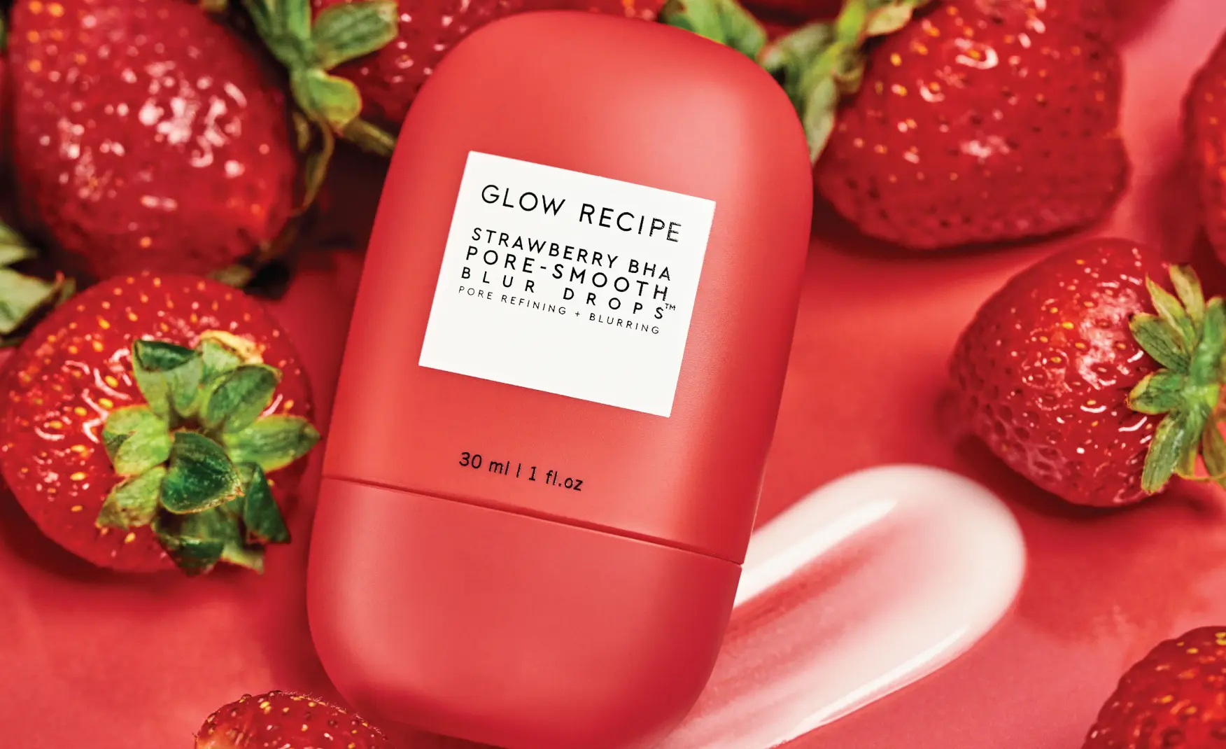
Everything that makes Glow Recipe recognisable comes down to its visual identity: the watermelon colour, the whipped banana texture, the pit-shaped scoop.
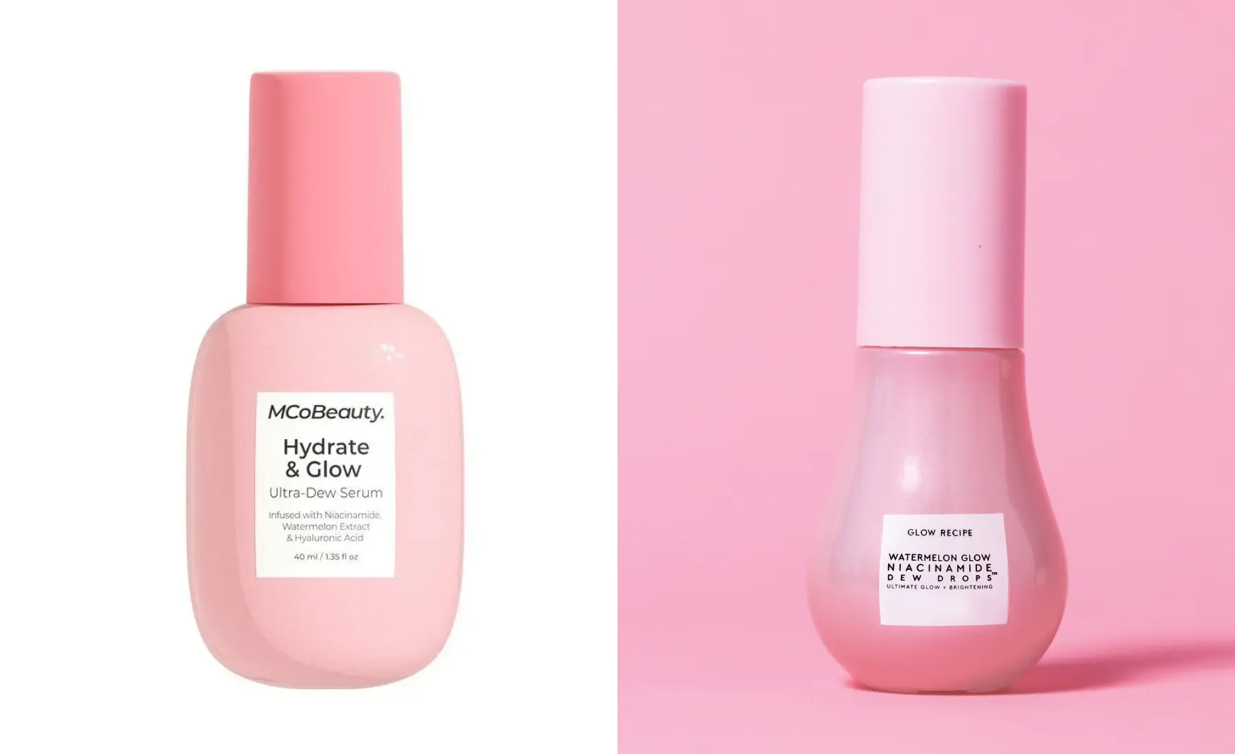
Glow Recipe sued MCoBeauty, an Australian brand known for dupes, in June 2025 over packaging for its Watermelon Glow Niacinamide Dew Drops. Target was later added to the lawsuit and quietly settled in June 2026, while the case against MCoBeauty keeps growing.
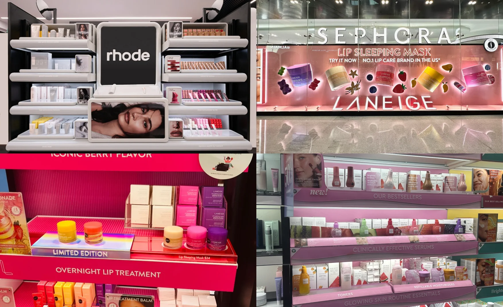
Sephora controls how Glow Recipe is stocked, placed and promoted. It carries every one of Glow Recipe's competitors too, often on the very same shelf, at the very same eye level.
A decade of growth has run almost entirely through this one relationship. That means Sephora's decisions, on shelf space, on promotional calendars, on which new brands get priority, can shape Glow Recipe's future more than the brand's own choices can.
If that relationship ever cooled, or Sephora simply started favouring a newer name instead, there's no real second channel built up to catch the fall.
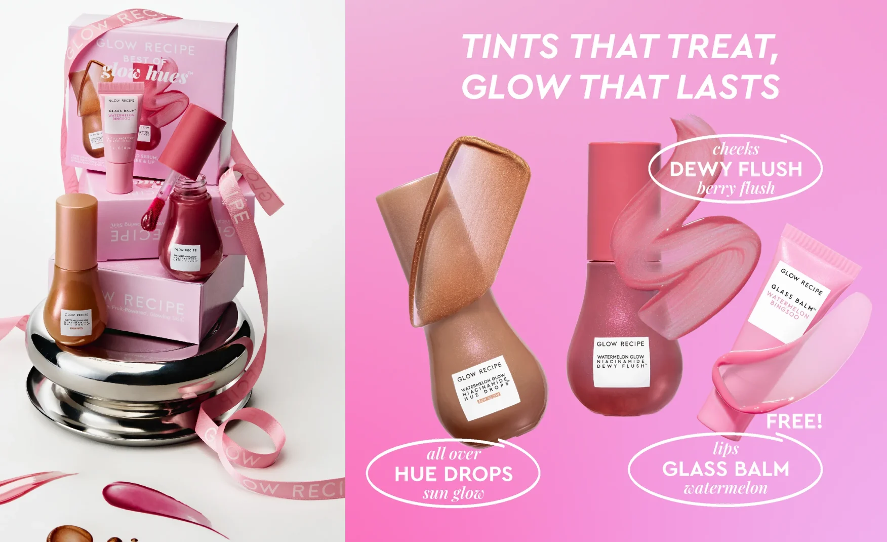
Fruit plus active is an excellent system with a finite premium tier.
As customers get to know more about what's actually in their skincare, a cute watermelon on the label starts to feel like a red flag rather than a selling point especially for the brand's priciest products. It makes people wonder if they're paying for a fun design, or for ingredients that actually work.
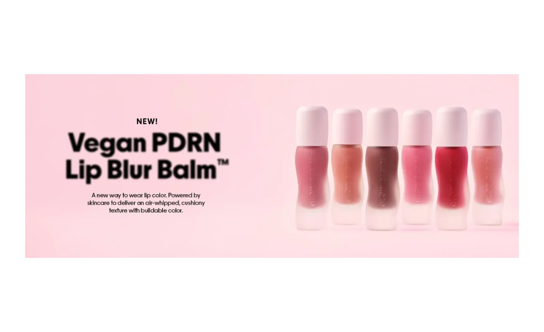
The range has already segmented into fruit powered hydration, clinical gentle treatments and a makeup category called Glow Hues.
Right now, the newer clinical grade products still look like part of the fun, fruity lineup. But as customers get more serious about skincare science, that playful packaging may need to improve alongside them.
Glow Recipe’s formulas are properly developed and manufactured with Korean labs.
One thing it lacks is Korean corporate ownership or a founding story rooted in Korea itself, unlike COSRX, majority owned by AmorePacific, or Beauty of Joseon, which draws directly on centuries old Korean ingredient traditions.
That distinction doesn't cost the brand anything right now, since most people are shopping on looks alone. But it becomes a real question the moment ingredient savvy shoppers start asking which K-beauty brands are actually Korean, and which are just American brands inspired by the category.
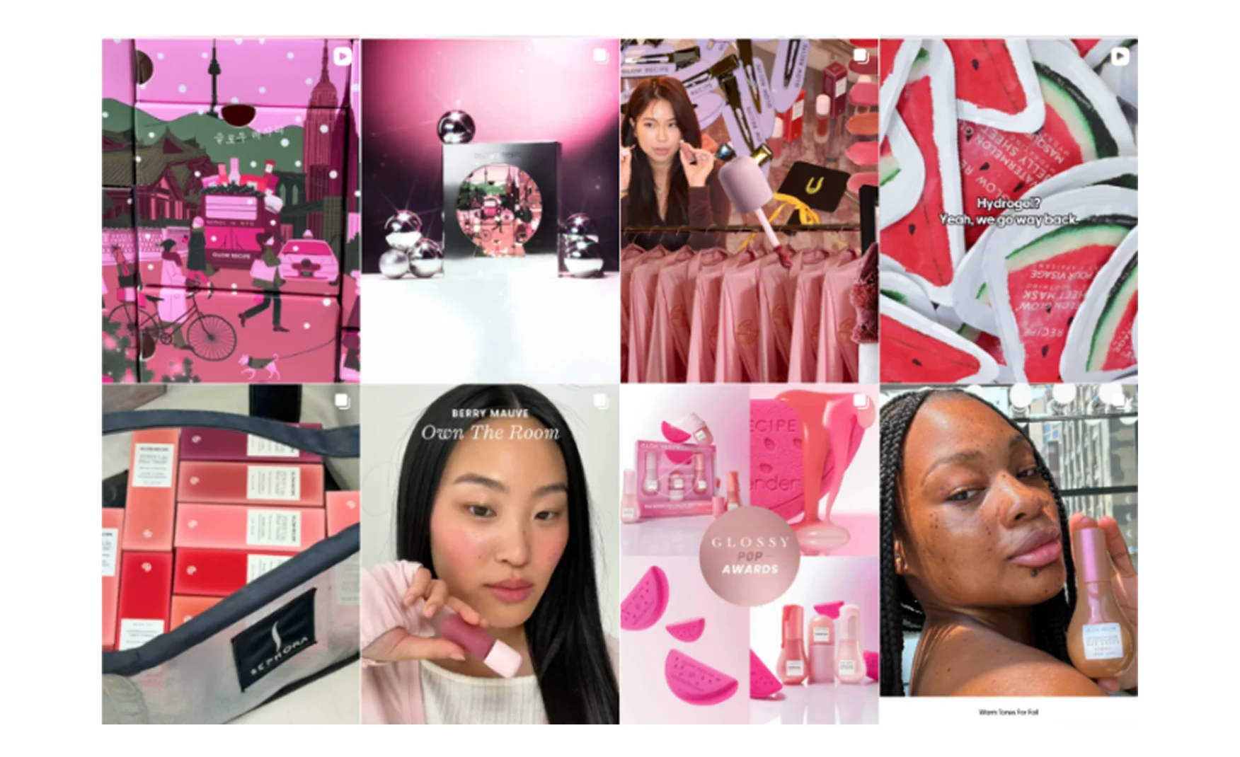
Glow Recipe’s feed is aesthetic, minimal and generic, cycling through product launches, UGC and pop-up imagery.
The Ordinary's Instagram focuses on explaining ingredients and uses dry, simple humour, instead of just posting pretty product photos. It's a sharper strategy, since it gives people an actual reason to follow beyond just liking the aesthetic, something Glow Recipe's feed doesn't quite offer yet.
And it almost never captures the everyday mindset or the no-retouching promise that actually makes the brand stand out.
This means the channel the brand posts on most often is doing the least to show what actually makes Glow Recipe different from all the other pretty looking skincare and makeup brands.
The clinical gentle range and Glow Hues need a visual system of their own. It should be recognisably Glow Recipe.
This line needs a different visual language under the same roof with a calmer typography, a cooler and narrower colour palette, with the active ingredient front and centre.
Doing this now, while the fruit range is still going strong, is a more careful strategy for growth. The fruit line should stay just as fun as it is, while the clinical line gets built.
Ranking first for a major category query across every significant AI engine is a real asset.
It's worth real attention that writing product info and ingredient claims clearly enough that AI systems can read them, trust them, and quote them right.
Glow Recipe is one of the best lessons for modern beauty packaging has to offer, and the reason is simple: the decision that actually built the brand was never about graphic design. It was about picking a fruit, a colour, and a texture people already associated with comfort and care, and building everything else around that feeling.
The team designed the product's colour, texture and applicator for how it would look in a stranger's fifteen second video, not just for how it would look on a shelf.
That turned the packaging itself into the marketing budget, and the result is more than $300 million in yearly revenue, with the founders still holding onto majority control.
The next chapter is about turning that charm into something more structured.
The brand's real strength is the look but customers will eventually want the clinical range to actually look clinical as they grow more skincare savvy.
If you are building a skincare brand and want packaging designed for how products are actually discovered today, this is exactly the work we do. Get in touch with our team at Confetti.
Want strategic branding and packaging like this for your business?





.webp)
.webp)


.webp)
.webp)
.webp)
.webp)
.webp)







.svg)
.webp)


.svg)
.svg)




































































.webp)







.webp)


.svg)